
Comarch ERP Enterprise applications are flexible and have an adaptable interface, owing to which users can quickly and easily adjust the interface of individual applications to their needs at both the interface and database level. Moreover, users can create own views within selected application panes.
This article describes how to modify views, customize the interface to the user’s needs, and which authorizations are needed for this.
Activating and deactivating the design mode
The interface can only be customized when the design mode is activated. To activate the design mode, click the [Select and organize views] button in the standard toolbar and choose the [Design mode] option in the drop-down list.
The navigation pane of the dockable view will display an additional tab Design mode (only visible if the design mode has been activated) and the wrench icon will appear before the application name.
The Design mode tab is also available after selecting [Menu] → [Dockable views] → [Design mode].
Make sure to save all changes entered in the application before activating the design mode.
To deactivate the design mode, click the [Select and organize views] button in the standard toolbar again and choose the [Design mode] option in the drop-down list. The application will return to the standard mode.
Design mode tab
The tab contains its own toolbar.
Using the [View menu] button, the user can change the location of the Design mode tab according to individual needs:
- [Left] – the tab is displayed on the left-hand side of the screen
- [Right] – the tab is displayed on the right-hand side of the screen
- [Bottom] – the tab is displayed in the bottom part of the screen
It is also possible to switch to the [Auto hide] mode.
To close the tab (without deactivating the design mode), select the [Close] button.
The Design mode comprises the following subtabs:
 Structure
 Attributes
 Widgets
The following options are available for both the Structure and Attributes tabs:
- [Show element in application] button – by default, the button is inactive. If the user activates the button, its icon is highlighted and the user can view the location of application elements selected in the list on the Structure tab. Once a list element is selected, it is framed in the application interface.
- Properties and Help tabs – under the subtabs, two additional tabs are provided. If the user clicks an element in the application interface, technical information about that element is displayed on the Properties tab (only available for elements selected on the Structure tab). This information is primarily of interest to developers. On the Help tab, the user can view the What’s this help concerning the selected element.
Structure tab
The Structure tab contains the tree structure of a given application. The user can browse through the structure in a similar manner as in the case of a file browser.
The following functions and information are available for the structure:
- [Show element in application] button – it allows highlighting a selected element in the opened application
- Properties and Help tabs – they allow displaying information about a selected element
Attributes tab
The Attributes tab contains attributes that can be added to a given application. Attributes already used in the application are marked by a green check mark on the left of the element description. The user can place other attributes at the desired location by dragging and dropping them. Attributes may be deleted from the interface application by right-clicking them and selecting [Delete].
The following functions and information are available for attributes:
- [Show element in application] button – it allows highlighting a selected element in the opened application
- Help tab – it allows displaying information about a selected attribute
Views
Applications open with the view set as Default. The user can save adjustments in views to be available either only to the user himself/herself or to all database users having appropriate authorizations. More information on database-wide settings may be found in the Database-wide settings chapter.
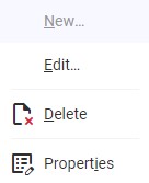
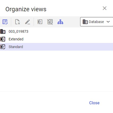
Using the [Select and organize views] in the standard toolbar makes it possible to select one of the available application views and organize all the views.
Selecting a view
The menu displayed after using the [Select and organize views] button displays all available and not hidden views. Icons show whether a given view is user-defined or database-wide. The view defined as default is additionally defined by a green check mark icon. The currently displayed view is highlighted. To switch to another view, click it in the menu.
Organizing views
The menu displayed after using the [Select and organize views] button contains the [Organize views] action that allows the user to manage views. The window opened with the [Organize views] action contains the list of views and a toolbar with the following buttons:
- [Properties] – it displays a given view’s technical properties
- [Remove] – it deletes a selected view
- [Rename] – it allows changing the name of a given view. To change a view’s name, it is necessary to select it and click the [Rename] button.
- [Specify as default] – it allows changing the default view
- [Hide view] – it hides/displays a view in the list of available views
- [Assign organizations] – it allows hiding a view or defining the default view for one or more organizations
Views can be edited at the user and database levels. More information may be found in the Organizing a view at the database level chapter.
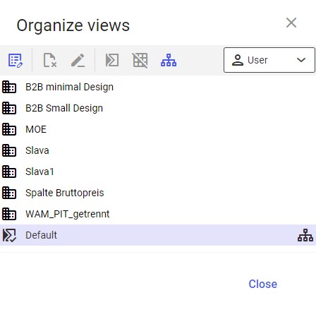
Creating a new view
After the user selects the [Select and organize views] button in the standard toolbar and chooses the [Design mode] option, the list of views displays a new option [New view]. The option makes it possible to create a new view in a given application pane based on the programmed layout.
The [New view] button opens a window with the following fields:
- Type – it specifies on what device the view is to be displayed. Available options include:
- Default – for a desktop computer user
- Smartphone – for a smartphone user
- Level – it allows defining a level at which the view is to be available. Available options include:
- Database – the view will be available at the database level
- User – the view will be available at the user level
The Database option is only available if the user has sufficient authorizations. Otherwise, only the User level is available and the field is non-editable.
Saving a view
After making changes in the application interface, the user can save them. To do so, click the [Select and organize views] button and select the [Save view as] option. A dialog window will open, where a view description should be entered (in several languages).
Additionally, the [Save view] option available under [Select and organize views] allows saving changes made within the current view.
Interface customization
Depending on the application, not all elements of the interface can be changed. Some elements or containers are influenced dynamically based on the data entered and cannot be customized. Besides, there is a difference between programmed fields and attributes. For instance, programmed fields are specified at the time the application is programmed and, consequently, cannot be removed. Attributes, on the other hand, are saved in object views that are independent of the base programming. Thus, they can be added, deleted, and moved.
Adding, deleting, or moving interface elements
When the design mode is activated, the user can use the drag & drop method to change the order of existing application fields. To do so, click the field whose position should be changed and, keeping the mouse button pressed, drag it to the new desired position. If it is not possible to move the field to that position, a lock icon is displayed.
A field can also be moved to a different tab. To do so, click the field to be moved and, keeping the mouse button pressed, move the field over to the relevant tab. The tab will open, and it will be possible to place the field at the desired position. If it is not possible to place the field on the tab, a lock icon is displayed.
If the destination position already contains another field, this field will be shifted one position downward. If this shift affects other fields, they will also be shifted one position downward.
Some areas can be protected for programming reasons. It is so especially in cases where a container presents dynamic data that is displayed based on the user’s input. These areas can neither be shifted nor is it possible to add or remove any fields there.
In addition, it is possible to adjust the width of a field. To do so, click the field to be customized and move the cursor to its right or left edge. By keeping the mouse button, drag the field to the desired width. However, the width cannot be set completely at will.
Right-clicking an interface element displays the following options:
[New]
Selecting this option displays a dockable window allowing the user to additionally configure a newly created element. The following sections/fields are available:
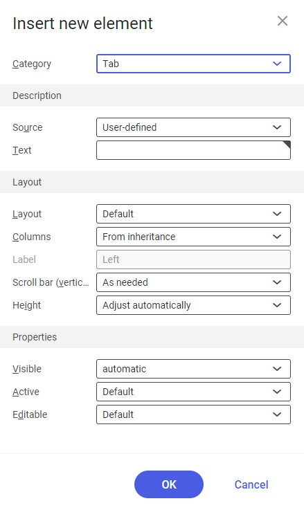
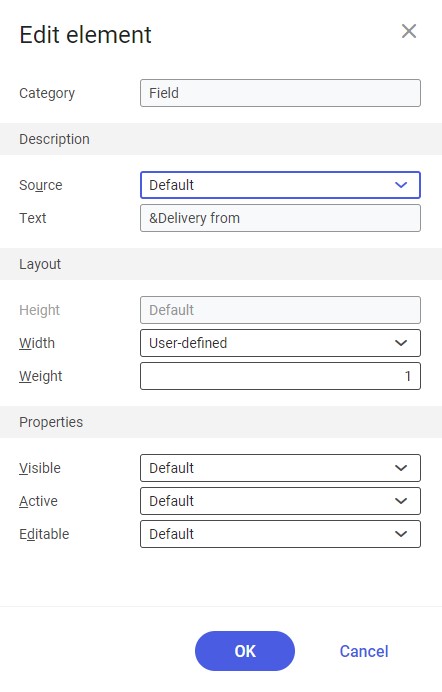
- Category – the system only offers those elements for selection which can be inserted within a given interface area. If an existing interface element is modified, this field cannot be edited but shows the chosen element’s category:
- Tab – this category can be selected in order to add a tab to an existing bar or to create a new bar with the tab. On the selected tab, it is possible to place fields and groupings. New tabs are placed to the left of the selected tab.
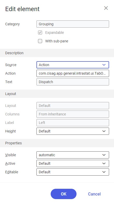
- Grouping – this category can be selected in order to add a new grouping to the interface. New groupings are placed under the already existing groupings. For the Grouping element category, additional fields are available:
- Expandable – this parameter is available for groupings created on new tabs and it makes it possible to define whether the new grouping should have an expanding/collapsing button. After a grouping has been added, this setting cannot be changed again. As a result, even if the interface element is edited later, the chosen setting can be displayed but not changed anymore. If the grouping is expanded when saving the view, it will also be expanded after deactivating the design mode.
- With sub-pane – this parameter makes it possible to determine whether the new grouping should have a drop-down sub-pane. After a grouping has been added, this setting cannot be changed again. As a result, even if the interface element is edited later, the chosen setting can be displayed but not changed anymore. If the sub-pane is expanded when saving the view, it will also be expanded after deactivating the design mode.
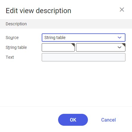
Description grouping
The grouping allows the user to select the source of an interface element’s description.
Depending on the selected source, additional required fields will be displayed. Available options include:
- Without – the source will not be entered
- Action – it allows using an action description to create the new element:
- Action (required field) – it is displayed after selecting the Action option in the Source field It uses an action description. With the [Value assistant] button, it is possible to select existing development objects which include the desired text for the interface element.
- String table – it allows creating an object with the use of a string table.
- String table (required field) – it is displayed after selecting the String table option in the Source field. In the first part of the field, select a development object of the String table category (it can be searched using the [Value assistant] button); in the second part, select (from a drop-down list) a string table entry that is to be used for the interface element. It is only possible to select existing development objects.
- User-defined – settings defined by the user. Selecting this option activates the Text field, where a relevant description should be entered.
- Text (required field) – in this field, it is necessary to enter the description of the interface element. It may be composed of up to 50 characters.
Layout grouping
This grouping makes it possible to arrange tab or grouping elements. Available fields:
- Layout – it allows selecting an element layout from the drop-down list. Available options include:
- Default – the standard grouping layout in the system
- Vertical – all elements are arranged one below the other and use the full width. This setting should be used if only groupings and elements with scroll bars are placed in this area.
- Horizontal – all elements are arranged next to each other
- Grid – it displays additional fields that make it possible to define the layout of a tab or grouping. Values in those fields should be filled in manually:
- Number of rows
- Number of columns
- Vertical gap
- Horizontal gap
- Columns – it makes it possible to select the number of columns to arrange attributes below a tab or within a grouping. Available values include:
- 1
- 2
- 3
- 4
- From inheritance – the number of columns is based on the first top area of the application for which the number of columns has been defined. Selecting this value deactivates the Label field.
- Label – it allows defining the location of field descriptions (labels). Available options include:
- Top – above the fields
- Left – on the left-hand side of the fields
- Scroll bar (vertical) (displayed only for the Tab category if the User-defined option has been selected in the Source field) – it allows the user to configure the visibility of the vertical scroll bar on tabs:
- As needed
- Never
- Always
- Height (available for the Tab element category) – it makes it possible to determine whether the height of a given interface element is to depend on the preferred default or whether the height is to be adjusted automatically to the available height of the chosen layout. Available options include:
- Default – the height is calculated based on the preferred height of an interface element and the chosen layout
- Adjust automatically – the preferred height of an interface element is not taken into account. The height is adjusted to the chosen layout.
- User-defined – settings defined by the user. Selecting this option displays the Weight field:
- Weight – it makes it possible to enter a value between 1 and 999. By means of this setting, it is possible to allocate the available space within a grouping or a tab to interface elements located there.
Properties grouping
- Visible – by means of this field, it is possible to define the visibility of a given interface element. Available options include:
- Default – in this case, programming and any authorization specifications for interface elements determine whether a given element is visible
- Not visible – an interface element is not displayed and only visible in the design mode
- Automatic – this setting is used to automatically hide an element group (groupings/tabs) if no visible elements are available within such an element group. It also refers to the case where individual elements were visible according to programming and any authorization specifications for interface elements. Tabs are visible and editable in the design mode.
- Active – it allows defining whether a given interface element is to be active. Available options include:
- Default – in this case, programming and any authorization specifications for interface elements determine whether a given element is active
- Inactive – a given interface element is deactivated
- Automatic – this setting is used to automatically deactivate an element group (groupings/tabs) if no active elements are available within such an element group. It also refers to the case where individual elements were active according to programming and any authorization specifications for interface elements.
- Editable – it allows defining whether a given interface element is to be editable. Available options include:
- Default – in this case, programming and any authorization specifications for interface elements determine whether a given element is editable
- Not editable – a given interface element cannot be edited
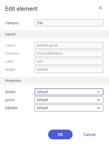
Element editing windows display a given element’s name in the Category field and most of the fields used to originally create that element.
[Delete]
The [Delete] button makes it possible to delete a given element from the application and move it to the Attributes tab. If necessary, the element can be added to the application again via the drag & drop function. The user can only remove elements that have been added in the design mode.
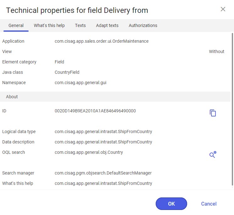
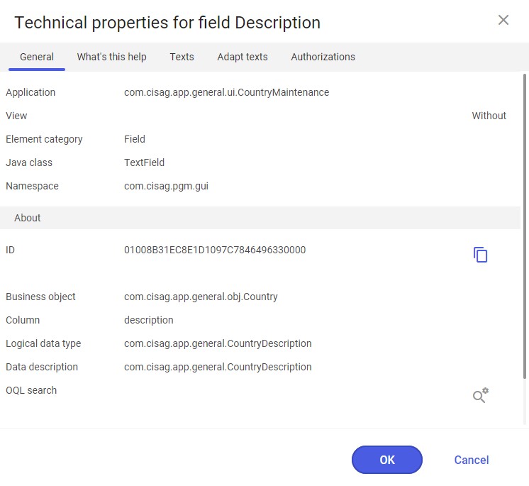
[Properties]
The [Properties] button opens the Technical properties window for a selected element. The window contains additional information on the selected element and makes it possible to customize texts or assign authorizations provided the user himself/herself has necessary authorizations for this.
Customizing tables
In addition to fields, tabs, and other interface elements, it is also possible to customize tables. Customizations are saved for a selected view only.
Customizing column width
Column width can be customized freely. To do so, click the edge of a column’s header and drag it to the desired width. A guide line displayed indicates what the width of the column will be as soon as the mouse button is released.
Defining columns by the drag & drop function
It is possible to specify the position of a column by dragging & dropping its header to the desired position in the table header. A red box indicates the space that will be taken up by the column once the mouse button is released. In this case, the column to be moved only affects the width of the column by which it is to be placed (if more columns exist in the target area), not affecting the width of other columns. If the user drags a column directly under the row of the column headings, a new column heading row will be created, containing the shifted column.
If a column cannot be placed at the desired position, a lock icon will be displayed.
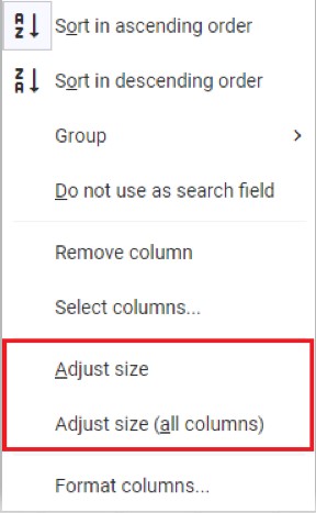
Adjusting column size
The system makes it possible to adjusting column size, thanks to which the user can define the width of each column separately or of all columns at once. To customize the size of a column, click it with the right mouse button and select the [Adjust size] button. The selected column will expand, getting optimal width relative to other columns. To make all columns get the optimal size within the width of the table row, click any column with the right mouse button and select the [Adjust size (all columns)] button.
Organizing a table view
The [Manage views] button allows the user to organize a table view; the button is only available in the table toolbar in the design mode. The following options are available under the button:
- [New view]

Settings in the new table view are grouped within the Description grouping and make it possible to define a view description. After selecting the [OK] button, the new table view is displayed in the list of views and can be edited.
- [Duplicate view]
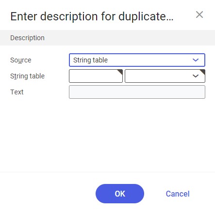
If table views already exist, the user can select one to duplicate it. To do so, select the table view to be duplicated, click the [Mange views] button in the table toolbar and select the [Duplicate view] option. The system will display a dialog window making it possible to define the description of the view to be duplicated. The data of the original view is displayed by default. Table views may be previewed in the drop-down list in the table toolbar.
- [Rename view]
To rename a table view, select the view, click the [Manage view] button and select the [Rename view] option. Next, define appropriate values in the dialog window displayed.
- [Delete view]
The user can delete an existing table view. To do so, select the table view to be deleted, click the [Manage view] button in the table toolbar and select the [Delete view] option. As a result, the table view will be deleted.
If only one table view is available, this option is not available. The delivered standard view cannot be deleted.
Detail searches
The [Detail searches] button makes it possible to manage detail search operations in a given table. Besides available searches, the button’s menu contains the following options:
- Display all detail searches – this option is active if there are detail searches that have been hidden (with the use of the [Hide all detail searches] button)
- Hide all detail searches – it hides detail searches (the option is active if detail searches have been selected)
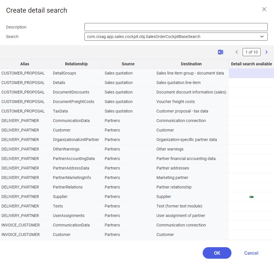
- Create detail search – it displays a dialog window that allows the user to create a detail search. New searches will be displayed at the top of the list available under the [Detail searches] button.
- Organize detail searches – it displays a dialog window that allows the user to organize detail searches (if available): they can be deleted, renamed, or exported to a file
Managing query and result properties
The [Define query and result properties] menu button contains the following options:
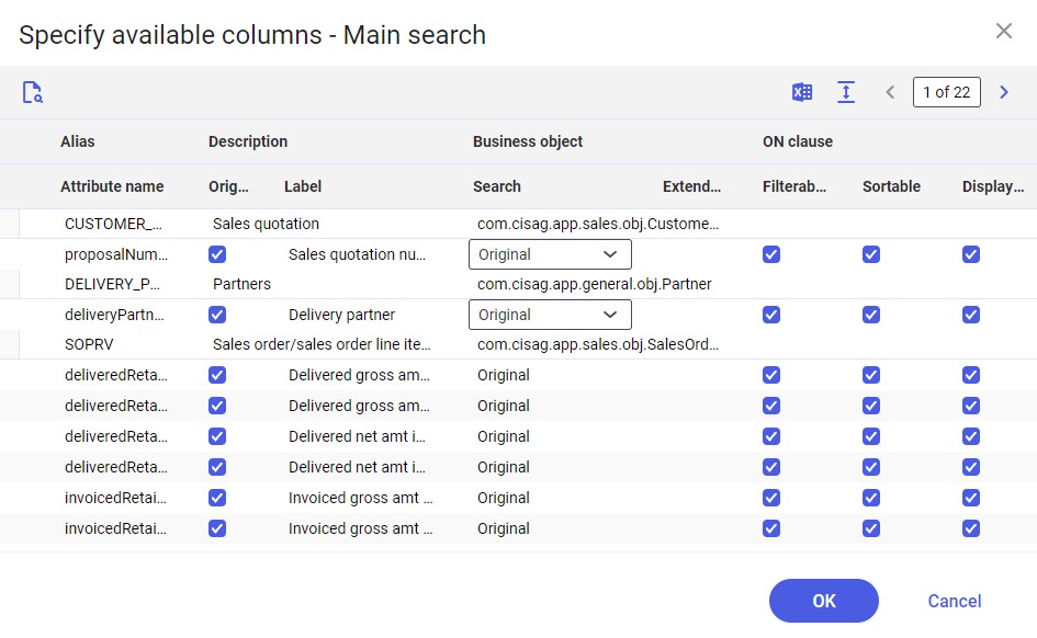
[Specify available columns]
The [Specify available columns] button (available for the main search, basic line items, sub-items, and each of the available detail searches) displays a dialog window that allows the user to define advanced settings for application columns, e.g. with regard to filtering, sorting, or display.
[Specify view properties]
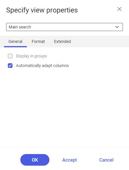
The Specify view properties dialog window contains the following fields and parameters:
- A drop-down list in which the user can define for which elements settings are to be displayed
General tab
The tab contains general display settings for a selected view:
- Display in groups – it allows grouping objects displayed according to defined criteria. Such criteria can be defined using the [Specify grouping and sorting] option.
- Automatically adapt columns – by means of this function, the user can specify that the width of a column is to be adjusted according to the longest text in the column. If this causes the width of the available space for the result list to be exceeded, the column widths will be adjusted accordingly. If this property is deactivated, columns will not be adapted automatically. This may cause some columns to disappear from the visible range, so that a horizontal scroll bar will be added. This does not refer to fields allowing the selection of multiple objects and grouping rows. Those are fixed and thus always remain visible despite the horizontal scroll bar. In addition, this mode makes it possible to fix selected columns, which allows preserving a better appearance of the overall layout when scrolling horizontally.
Format tab
- Preview – at the top of the dialog window under the Format tab, there is a preview of the defined view properties. It makes it possible to check changes in the view properties in advance.
- Display vertical lines – selecting this function displays vertical frame lines for each column
- Display horizontal lines – selecting this function displays horizontal frame lines for each column
Background color grouping
- Color drop-down list – the list makes it possible to select an available background color for a table. The default value is Standard.
- Alternating – this function can be used to specify that every second record is to be displayed in an alternative color. Thus, the individual records can be better separated from each other. If this function is activated, another field will be displayed, in which it is possible to select one of the available colors.
[Specify search fields]
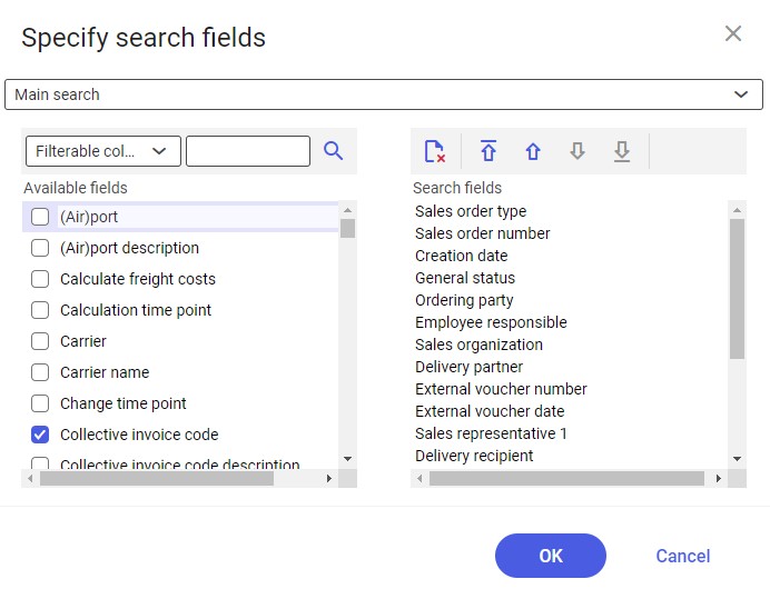
The Specify search fields dialog window makes it possible to select fields that are to be displayed in the application. The left-hand side of the table displays fields already marked to be displayed and available for selection. The selected fields are presented on the right-hand side of the table, where the user can manage their arrangement using the following buttons: [Remove], [Move element in the sort order to the first position], [Move element up in sort order], [Move element down in sort order], and [Move element in the sort order to the last position]. The buttons are activated depending on the position of an element selected in the list. Fields marked in the table will be directly displayed in the application within a section that has been selected from the drop-down list at the top of the dialog window.
[Specify grouping and sorting]
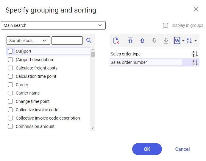
The left-hand side of the window presents properties according to which columns can be grouped and sorted; the right-hand side makes it possible to add features according to which these actions are to be performed.
[Select columns]
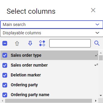
The Select columns dialog window makes it possible to select columns that are to be displayed in a given table. Available options include:
- A drop-down list of searches for which the settings are to be applied
- A drop-down list of available columns for which the settings can be applied
- [Toggle selection of all elements] – it can be used to select all the columns available in the dialog window. Unselecting the field automatically unselects all the columns.
- Arrow buttons – they make it possible to arrange selected columns within the table. The window’s list presents their order. In order to change the position of a column, click it and select an appropriate action: [Move selected element up] or [Move selected element down].
- [Display technical names/descriptions] – selecting this button allows displaying the technical names of columns in the dialog window
- Search field – it allows searching a column name according to previously defined settings: the system will either search a description or a technical name
[Format columns]
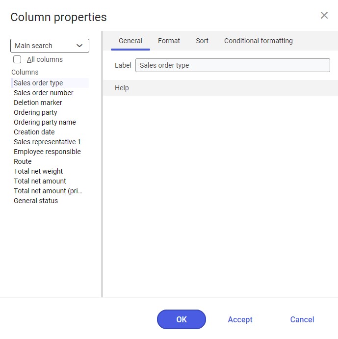
The top-left part of the Column properties dialog window contains a drop-down list of searches for which settings are to be applied, the All columns parameter, and the list of columns for which properties can be defined. If the All columns parameter is activated, columns that are not displayed in a given table view can be selected.
To define column properties, first select a given column in the list. Next, select a tab on the right-hand side of the dialog window to define corresponding properties.
After specifying the properties, the user can select the [Accept] button to save the properties and keep the dialog window open. It is also possible to select [OK] to save the properties and close the window at once. To cancel changes, select the [Cancel] button.
The window contains the following tabs:
- General – it displays the label of the currently selected column
- Format – it allows managing the formatting of the column
- Font grouping – it allows defining the font color, font weight, and font style, as well as the background color of the column
- Orientation grouping – it allows defining the orientation of the column
- Size grouping – if some column should not be taken into account when automatically adjusting columns, the Do not adjust automatically parameter should be selected
- Aggregation type grouping – this grouping makes it possible to define the aggregation type for columns (if applicable). The Function field contains available aggregation types: Total, Minimum, Maximum, Average, None. The Function field is active depending on the selected column.
- Sort – it allows determining according to which features data is to be grouped and sorted
- Sorting grouping – it makes it possible to define a sorting direction as Ascending or Descending
- Grouping grouping – it makes it possible to additionally define column properties using the following settings:
- Interval:
- Standard (By value)
- By value
- By starting letter
- Display:
- Standard
- Extended
- Suppress
- Display column in view – this parameter makes it possible to display columns in a view
- Interval:
- Conditional formatting – using conditional formatting, it is possible to define the method of displaying particular elements. For instance, the user can change the background color or bold, underline, and italics settings. It is also possible to define whether a given change is to be applied to a single cell or to an entire row.
Showing and hiding areas
The user can show and hide various table areas to make the optimal use of the available space. To show or hide sections, click the [Hide/show ranges] button in the table toolbar. The menu displayed makes it possible to select a range to be shown or hidden.
Available options include:
- [Show/Hide list header]
- [Show/Hide line status]
- [Show all areas]
- [Hide all areas]
- [Show/Hide grouping and sort area]
Database-wide settings
If the user has required authorizations, he/she can save interface changes at the database level. This chapter explains the functions that work at the database level.
Saving a view at the database level
The user can save views at the database level so that the view is available to all the users of the database. To do so, it is necessary to perform the following steps:
Precondition:
- The design mode is activated
- Open the modification window of a selected interface
- Click the [Save view as] button in the standard toolbar under the [Select and organize views] button
- Select the Database option in the Level field’s drop-down menu
- Enter the name of the view in the Description field
- Confirm changes with the [OK] button
To make a view that has been saved at the user level also available at the database level, select it in the menu of the [Select and organize views] button.
Organizing a view at the database level
Any options available in the Organize views dialog window (displayed after clicking [Select and organize views] → [Organize views]) at the user level can also be executed at the database level, provided the user has the required authorizations. To organize views at the database level, choose the Database option from the drop-down menu at the top right of the Organize views window. All functions available in this window will then be executed at the database level. This way, the administrator may, for instance, create views for all system users or hide views that should not be used by particular users.
View properties
The [Properties] action allows defining view authorizations. To do so, right-click a given element. The element is then highlighted with a blue frame and a menu is displayed, where it is necessary to select the [Properties] button. The button opens the Technical properties dialog window.
Organization assignments
The user can hide a view or set it as default for one or several organizations to which the user account is assigned.
Authorizations
The following authorizations can be assigned with respect to the customizable interfaces:
- Authorization to activate/deactivate the design mode:
Define/change application layout
com.cisag.sys.gui.ChangeLayouts
- Authorization to change customizable interfaces at the database level:
Define/change application layout for all users
com.cisag.sys.gui.ChangeLayoutsForAllUsers