
Contents
Most controls used in POS application come from the Comarch.POS.Presentation.Core.Controls namespace. However, this does not apply to all controls; for instance, the TextBlock control does not have a POS counterpart and the standard control provided by the .NET platform is used. Also, some controls specifically created to meet particular business needs are located in such modules as Comarch.POS.Presentation.Products, Comarch.POS.Presentation.Customers, or Comarch.POS.Presentation.Sales. Selected components are described below.
TextBlock
It is one of the basic controls that enables the presentation of text. It comes from the System.Windows.Controls namespace.
SlideTextBlock
It is a TextBlock control enhanced with a text slide animation. Every time a value is entered in the Text property, the text is displayed with the animated effect. If another text has been entered before, it disappears with the animated effect at the same moment. This control is used, for instance, on the start screen indicating progress when starting the application.
The control’s available configuration options include:
SlideInDuration : double – the time of the text slide-in animation, expressed in milliseconds. By default, it is set as 500.
SlideOutDuration : double – the time of the text slide-out animation, expressed in milliseconds. By default, it is set as 0.
SlideInLength : int – the distance to be covered by text in the slide-in animation. By default, it is set as 400.
SlideOutLength : int – the distance to be covered by text in the slide-out animation. By default, it is set as 500.
TextBox
This control allows users to enter text.
Selected properties include:
- Hint : string – it is a text hint displayed in the control if it is not filled in. The hint’s color is defined by the HintForeground property. The hint may be displayed in one of two modes, configurable in the application’s configuration file under the ClearHintOnFocus key. Its default value false makes the hint disappear when the user starts to type in the control; in turn, the value true makes it disappear right after placing the cursor in the control.
- HintForeground : Brush – it sets the hint’s color.
NumericTextBox
It is a TextBox control for entering numeric values only.
Selected properties include:
- AllowOnlyPositiveValues : bool – this flag allows determining whether negative values should be allowed
- ValueType : ValueType – it allows determining whether only integer values should be accepted
- Precision : int – it defines precision for floating point values
- MinValue i MaxValue : object – it allows defining the range of acceptable values
- IsDefaultNullValue : bool – it allows leaving a field empty
PasswordBox
This control allows entering text in a secure manner, hiding the option to preview characters entered in the interface.

Button (CancelButton, AcceptButton, etc.)
Button is one of the basic controls supporting user interaction. It allows performing a given action when clicked by the user. By default, buttons resemble (since they are actually 90×80) squares of different colors. Each button may contain any text describing its function, a hotkey (allowing users to trigger an action without clicking) and an icon (in vector format or graphic file such as png).
All available button properties (such as their color, text, dimensions, etc.) are freely adjustable. However, to make working with the application easier, some dedicated buttons have already been prepared. For instance, the [Close] button (CancelButton) or [Save] button (SaveButton) already have predefined colors, so that you do not have to specify them each time. The buttons’ texts, hotkeys and icons are predefined as well. All available button variants are added in the namespace Comarch.POS.Presentation.Core.Controls.Buttons.
Selected major properties include:
- Content : object – content (most frequently, text) displayed inside a button
- Orientation : Orientation – text and icon orientation. By default, it is set as Vertical, with text placed underneath an icon. After switching orientation to Horizontal, an icon is displayed on the left and text on the right.
- Width : double – button width; by default: 80
- Height : double – button height; by default: 90
- Margin : Thickness – button margin
- InactiveVisibility : Visibility – the visibility of an inactive button, i.e. when IsEnabled=false (for instance, when the action activator returns false)
- Command : ICommand – an action in the form of a command; the most common binding to the DelegateCommand type
- DisabledState : Brush – the color of a visible inactive button
- ImageKey : ImageKey – setting of one of the graphic icons (PngValue) or vector icons (SvgValue) available in the currently selected theme
- ImageWidth : double – icon width
- ImageHeight : double – icon height
- IsImageVisible : bool – icon visibility
- ImageMargin : Thickness – icon margin
- ContentVisibility : Visibility – text visibility
- IsScaleContent : bool – scaling of text that does not fit in a button; by default: false
- Shortcut : Shortcut – a hotkey to be used instead of clicking
- IsShortcutVisibile : bool – hotkey visibility
CheckBox
This control allows users to select one of the two logic states. It is displayed as a button, whose color changes depending on the selected state.
Selected properties include:
- IsChecked : bool – current logic state; true – the button is selected, false – the button is not selected
- CheckedStateBackground : Brush – the background color of a selected button
- CheckedStateForeground : Brush – the text color of a selected button
- DisabledStateBackground : Brush – the background color of an inactive button, when IsEnabled=false
- DisabledStateForeground : Brush – the text color of an inactive button, when IsEnabled=false
What is more, the CheckBox control contains most of the properties of the Button control.
SwitchBox
This control is based on the CheckBox control; the main difference between these two controls is the method of their presentation. Like CheckBox, the control can assume one of the two states (true – selected/enabled, false – unselected/disabled). The control resembles a switch and it can be provided with the description of an action performed after its state is changed.
Selected properties include:
- SwitchOffContent : object – content to be displayed if the switch’s state is false
- SwitchOnContent : object – content to be displayed if the switch’s state is true
- Content : object – content describing the switch’s function (i.e. a task it completes)
- IsChecked : bool – the switch’s state; enabled – true, disabled – false
What is more, the SwitchBox control contains most of the properties of the CheckBox control.
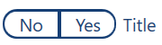
NullableSwitchBox
This control is based on the SwitchBox control. The main difference between these two controls is the method of their presentation and that NullableSwitchBox accepts three states (<null> – no button is selected, <true> – the right button is selected, <false> – the left button is selected). The undefined <null> state can only be the initial state (unless configured otherwise). Once it is changed to another state, it cannot be set anymore. The control resembles a pill, and it can be provided with the description of an action performed after its state is changed.
Selected properties include:
- SwitchOffContent : object – content displayed for the left button (selecting the button corresponds to switching to the <false> state) (default value: No)
- SwitchOnContent : object – content displayed for the right button (selecting the button corresponds to switching to the <true> state) (default value: True)
- Content : object – content describing the switch’s function (i.e. a task it completes)
- IsChecked : bool? – the switch’s state (default value: <null>, i.e. none of the buttons is selected)
What is more, the NullableSwitchBox control contains most of the properties of the CheckBox control.
RadioButton
This control resembles the CheckBox control in terms of both its function and design. However, after several RadioButtons are created and given a common name (GroupName), only one button within the group can be selected at a given moment.
Selected properties include:
- IsChecked : bool – selection state; true – selected, false – unselected
- CanUndoSelection : bool – allowed unselection (i.e. setting IsChecked=false) by clicking the control again
ComboBox
This control allows users to select one of multiple options available in the form of a drop-down list. It resembles a TextBox control with an additional icon for expanding the list of available options.
Selected properties include:
- Hint : string – a hint displayed if no value from the drop-down list has been selected
- HintForeground : Brush – it sets the hint’s color
- PopupBackground : Brush – it sets the background color of the drop-down list
- ItemsSource : IEnumerable – the set of selectable options
- SelectedItem : object – the selected option
ComboBox2
It is an extended version of the ComboBox control, presenting available options not in a simple popup, but in a modal window. By default, the window displays the options in the form of a list of RadioButtons. However, it is also possible to customize the content of the window.
The control is divided into two parts:
- an element presenting the selected option (in the form of a TextBlock with a description and a Button of a non-standard size underneath)
- the modal window with the list of options (by default, the list of RadioButtons)
Selected properties include:
- Source : IComboBoxSource – a required property: data source – for the default modal view, use the ComboBoxSource<T> type, where T is the data type of selectable options
- Label : string – text displayed above the control button
- LabelFontSize : double – label font size
- LabelFontWeight : FontWeight – label font weight
- LabelFontStyle : FontStyle – label font style
- FontSize : double – font size of the text inside the button
- FontWeight : FontWeight – font weight of the text inside the button
- FontStyle : FontStyle – font style of the text inside the button
The background of the entire control, foreground color, and button background cannot be changed directly. They depend on base colors selected for the theme.
See the chapter Examples of using the ComboBox2 control in Examples for more details.
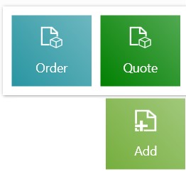
TileButton
This control is in fact a Button of a different size. It inherits from the Button class, so it contains all the properties of the Button control. It is used, for instance, in the main menu. Thanks to a dedicated method for registering views in the main menu, there is no need to create this control in the menu manually.
ButtonSpinner
This control, in connection with an input control placed inside (most frequently – TextBox), adds two supplementary controls ([+] and [–]). Each time one of them is selected, a Spin event is triggered. It may be used to manage the property of the internal control.
Selected properties include:
- Spin : EventHandler<ButtonSpinnerArgs> – it is an event triggered after selecting one of the ButtonSpinner’s buttons ([+] or [–]).
See the chapter Example of using the ButtonSpinner control in Examples for more details.
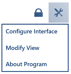
ComboBoxButton
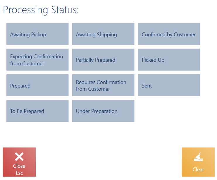
This control is an extension to the ComboBox control discussed above. Its function, however, is more similar to that of Button. It allows presenting a button in the form of an icon; as the icon is selected, a defined list of actions is expanded. The list’s items are specified using ComboBoxItem elements. The status menu may be an example of this control:
Selected properties include:
- LabelContent : object – additional, clickable content to the left of the icon
- ImageSource : Canvas – a button icon in the vector format
- SelectedItem : object – an option selected from the action list
- SelectedIndex : int – the index of the action selected from the action list
See the chapter Example of using the ComboBoxButton control in Examples for more details.
MultiButton
This control allows aggregating multiple buttons as part of a single button. Selecting the main button displays a pop-up with the full list of buttons. If the list contains only one button, the popup is not displayed – instead, the appropriate action is performed immediately. Aggregated buttons may also be fully manageable in the application; for instance, you can change their arrrangement or hide them (they are embedded in a manageable container).
Selected properties include:
- SubButtons : List<Button> – the defined list of aggregated buttons
See the chapter Example of using the MultiButton control in Examples for more details.
ItemsContainer
This control is based on .NET’s ItemsControl, so it allows storing other controls in an organized manner, most frequently as subsequent elements arranged vertically or horizontally. It has been enriched with mechanisms that allow the dynamic management of its defined content while the application is running. By default, the control presents the content in an order defined in xaml. This order and the visibility of previously specified elements can be changed while the application is running (a regular user can do so) using a dedicated panel for managing application views. Such changes are saved as part of the currently selected theme (except the default theme). You can configure the manageability of content elements by defining the LayoutId property for a control used in a given view and for each element contained as part of that control. Otherwise, to make a control manageable, both the control and its content elements must have unique identifiers defined. As content elements, you may use virtually any controls; most often, however, it is only a single type, such as the list of buttons. Elements may be defined in xaml or built in code, but without using bindings; instead, they should be added to collections using the AddItem control method.
Selected properties include:
- AutoWrapButtons : bool – it manages the option to automatically wrap buttons inside a container if they do not fit and to replace them with a [More] MultiButton (non-fitting buttons hidden within the popup). Additionally, for each Button control, you may determine if a given button should be wrapped (using the ItemsContainer.NoWrapButton property or directly in the POS layout managemenet panel on the General tab → Do not aggregate).
- Orientation : Orientation – horizontal or vertical orientation of content elements.
ItemsContainer and MoreMultiButton
In the case where an ItemsContainer’s size is defined, there are only Button controls in the container, and you want to store more controls than it can fit in, an additional MoreMultiButton control will be added to the ItemsContainer by default (i.e. if AutoWrapButtons=true); the additional control will store the buttons that do not fit.
If there is not enough space to add even one more control, the MoreMultiButton control will not be displayed; in such a case, you can use the AlwaysShowMultiButton=True flag that will always add MoreMultiButton, adjusting its size to the total available space.
Note that the CloseButton and SearchButton controls have the flag controls:ItemsContainer.NoWrapButton set as True by default, so they will not be subject to aggregation. If only a single control can fit inside an ItemsContainer, it will be precisely a control that cannot be aggregated; as a result, the MoreMultiButton will not be displayed.
You can set some properties for an automatically generated MoreMultiButton; see the chapter Supported properties in How to manage the layout and its elements for more details.
More information can be found in the chapters Examples of using the ItemsContainer control in Examples and How to manage elements in an ItemsContainer container in How to create manageable views.
Grid
Grid is another control essential for the purposes of layout management. It allows you to freely design a view using columns and rows storing subsequent elements. As in the case of ItemsContainers, users may dynamically manage Grid elements when the application is running. Elements defined inside a grid may be removed from it, moved between grid cells (made of columns and rows), or even moved to ItemsContainers and other Grids (if they have also been defined inside a given grid before). This control is recommended as a basis for fully manageable views. Inside a view’s xaml, this control is added at the beginning, with other controls necessary to design the view added inside of it afterwards. However, the view itself is not created in xaml, but directly in the layout management panel in the application, while the entire view’s definition (layout of elements) is saved as part of a theme.
Selected properties include:
- ColumnDefinition : string – it defines the number and size of columns according to the formula: k1,k2,k3,…kx, where k1, k2, k3, kx are values specifying subsequent columns; available values include:
- * – adjust column width proportionally, depending on the number of columns. It can be used together with a number to apply another width ratio, e.g. 2*.
- Auto – adjust column width automatically, depending on what is necessary for a stored element
- [number] – set column width as entered, e.g. 100
For example, a three-column grid, with the first column’s width defined as 150, the second as required by its stored element, and the third occupying the rest of available space, will be defined as follows: ColumnDefinition=”150,Auto,*”
- RowDefinition : string – it specifies the number and size of rows, similarly as in the column definition
To define which column and row should store an element defined inside a grid, set the element’s property Grid.Position. For instance, if you want to store the grid element in the third column and second row, enter: Grid.Position=”1,2,1,1” (1 – designates the second row, 2 – designates the third column, 1,1 – specifies that the element will occupy one row and one column).
For more details, see the chapters Example of using the Grid control in Examples and How to manage elements in a Grid container in How to create manageable views.
Tooltip
This control allows you to show additional information (such as detailed field descriptions) in a popup displayed by hovering the cursor over a defined area (Caption). Such detailed information may be composed of a Title and Content.
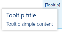
Selected properties include:
- Caption : object – any content (e.g. text or other controls) presenting a tooltip on hover
- Title : string – tooltip title presented in the popup
- Content : string – tooltip content
TabControl and TabControlItem
These controls allow you to present data in the form of tabs. Combining them with a Grid control, you can design a view composed of several TabControls (tab containers) and TabControlItems (tabs); the latter can then be freely moved between the view’s TabControls in the layout management panel. A great example of how to use tabs is the customer details view. It is composed of four TabControls that allow presenting such tabs as Addresses, Attributes, Statistics, and Contact Persons in any TabControl container.
Each container may be divided into two areas. The first area is the list of RadioButtons that allow switching between active tabs. If a TabControl has only one TabControlItem, this area is not displayed (outside the layout management panel). The second area presents the content of the currently activated tab. The default layout of the areas (content at the top, buttons at the bottom) can be changed at will.
Selected properties of TabControlItems include:
- TabContent : object – tab content’s definition
- Source : TabControlItemSource – data source for a tab content’s definition. If not set, the default data source will be DataContext of the TabControl, i.e. viewmodel.
The TabControlItemSource class is an abstract class providing only two properties that allow you to manage tab actions. These properties include the IsLoaded flag that must be set as true after loading data and the IsDesignMode tab set as true in the design viewmodel, switching the tab to the management mode.
For more details, see the chapter Example of using the TabControl and TabControlItem controls in Examples.
ScrollViewer
This control allows you to scroll content that does not fit in a view. It works only in the horizontal scrolling mode and is set so by default. To enable the vertical mode, use a control from the .NET namespace (System.Windows.Controls.ScrollViewer).
FieldControl and validation
FieldControl is used to handle form fields. It makes it possible to enable validation management in the user interface management view (it is required to define a control’s LayoutId). If you use the control, you no longer have to use a TextBlock/Label to define a field description.
For instance, if you want to add a text field to be filled in by the user in a given view, add the following in the xaml file of the view:
<controls:FieldControl core:Layout.Id="OrdersViewTextField1"
                                   Source="{Binding Field1}"
                                   LabelText=”Text field description:">

     <controls:TextBox core:Layout.Id="FieldTestsViewTextBox2"
            Text="{Binding Field1.Data,
            UpdateSourceTrigger=PropertyChanged, ValidatesOnDataErrors=True}"/>
</controls:FieldControl>
FieldControl’s Source property requires assigning a value of the FieldSourceBase type. The class is abstract, so you need to use one of the child classes FieldSource<T> or FieldSourceCollection<T>, or, if necessary, create your own implementation based on the FieldSourceBase class.
The generic class FieldSource<T> stores a single T value within the Data property. You may use it in combination with controls that will require the user to enter a single value – for instance, TextBox. The FieldSourceCollection<T> class stores element collections and the currently selected element. The collection is located in the Items property, and the currently selected element in SelectedItem. You may use it in combination with the ComboBox control. To activate the validation of the target control (in this case, the TextBox), add ValidationOnDataErrors=true in the binding.
In the viewmodel of your view, add the Field1 property of the FieldSource<string> type and create an instance. Optionally, the constructor allows you to define a default value to be displayed in the TextBox field after opening the view.
public FieldSource<string> Field1 { get; set; }
…
public OrdersViewModel()
{
    Field1 = new FieldSource<string>()
            {
                Error = “simple error message"
            };
    …
}
The class FieldSource<T> and FieldSourceCollection define the default field validation rule. It involves checking whether a given field is not empty if the Required property has been set in the layout management panel. To define your own validation logic, use the SetValidationRule method.
Using the Error property (see the example above), you can redefine the default error message displayed as a tooltip after hovering the cursor over a given field.
What is more, the FieldSourceBase class provides the following read-only properties:
- IsValid – allows you to check if a field is properly validated.
- IsRequired – allows you to check if a field has been tagged as required in the layout management panel
Additionally, to manually enforce validation in the viewmodel, use the RaiseValidation method.
See the chapter Examples of using the FieldControl control in Examples for more details.
DataGrid
This control allows you to present complex data in the form of a table with columns that act as headers and rows that contain detailed data. Information presented by the control can be grouped based on any column selected by the user in the layout management panel. Additionally, grouped data can be aggregated (e.g. based on summing, averaging, or a custom implementation). Data can be retrieved to the control in an asynchronous manner. The control supports the management of sorting and uploading more data when scrolling (paging) by sending appropriate requests to the data source. The control itself does not sort data; however, it provides information on how it should be sorted, leaving the sorting operation to the data source.
DatePicker and Calendar
The Calendar control presents a calendar and allows the user to select a date – year, month, day. The DatePicker control is a ComboBox that triggers a Calendar popup. Once a date is selected, it is assigned to the ComboBox.
Selected properties of DatePicker include:
- UndefinedDateText : string – if a text value is entered, it will be possible to clear the date by selecting a RadioButton with content defined in this property
- IsTextHidden : bool – it allows hiding the presentation of the selected date
- SelectedDate : DateTime? – selected date
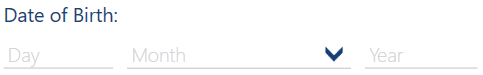
DatePicker2
DatePicker2 is an alternative method of selecting a date. It presents the date in three separate fields for day (TextBox), month (ComboBox), and year (TextBox). The control’s fields may be independently manageable. In the layout management panel, you can also change the order in which the date components are displayed, thanks to the fact that the components are embedded in the container.
Selected properties include:
- SelectedDate : DateTime? – date presented in the control
- IsMonthsListEditable : bool – it allows/blocks the option to edit the combo box with the list of months
- IsValid : bool – flag defining whether a date entered is correct
See the chapter Example of using the DatePicker2 control in Examples for more details.
AssistantControl
It is a special business control used in each trade document that allows selecting a person responsible for a transaction both regarding the entire document and its separate items. Its design and function closely resemble that of the ComboBox2 control.
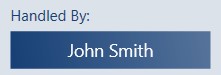
Selected properties include:
- Source : AssistantSource – data source of the control, binding to the AssistantSource instance
- Label : string – text displayed by the control (e.g. Handled By in a trade document)
AttributeControl
Another special business control supporting business object attributes. It allows presenting and editing attributes, depending on their types, in appropriate editing controls. For instance, a text attribute will be automatically presented as a TextBox control, while a logical one as a SwitchBox. See the chapter How to handle attributes in Layout management extensibility for more details.
BuyerControl and RecipientControl
These are business controls for selecting and presenting primary and secondary customers in trade documents. They are designed in a similar way as the previous two. They consist of a control and a data source connected with the use of binding.
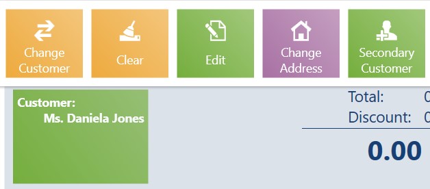
Selected properties include:
- Source : IBuyerSource – data source implementing the IBuyerSource interface