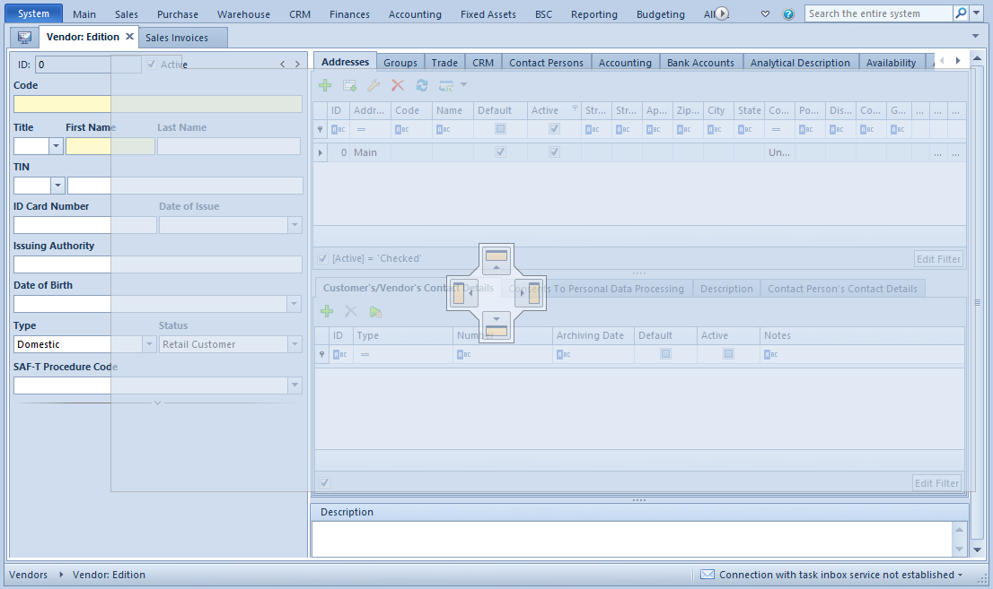
In order to optimize the area of the application, it is possible to use the functionality of window docking which allows for displaying two or more windows next to each other. To do so, it is necessary to open selected windows and drag the tab of a given window to the center of the main window. A place in which the dragged window can be arranged is indicated with the arrows. To place the new window in a given place, it is necessary to trop its tab over the proper part of the symbol. Other windows can be placed in any place of the active window.
Window docking
Exemplary arrangement of windows
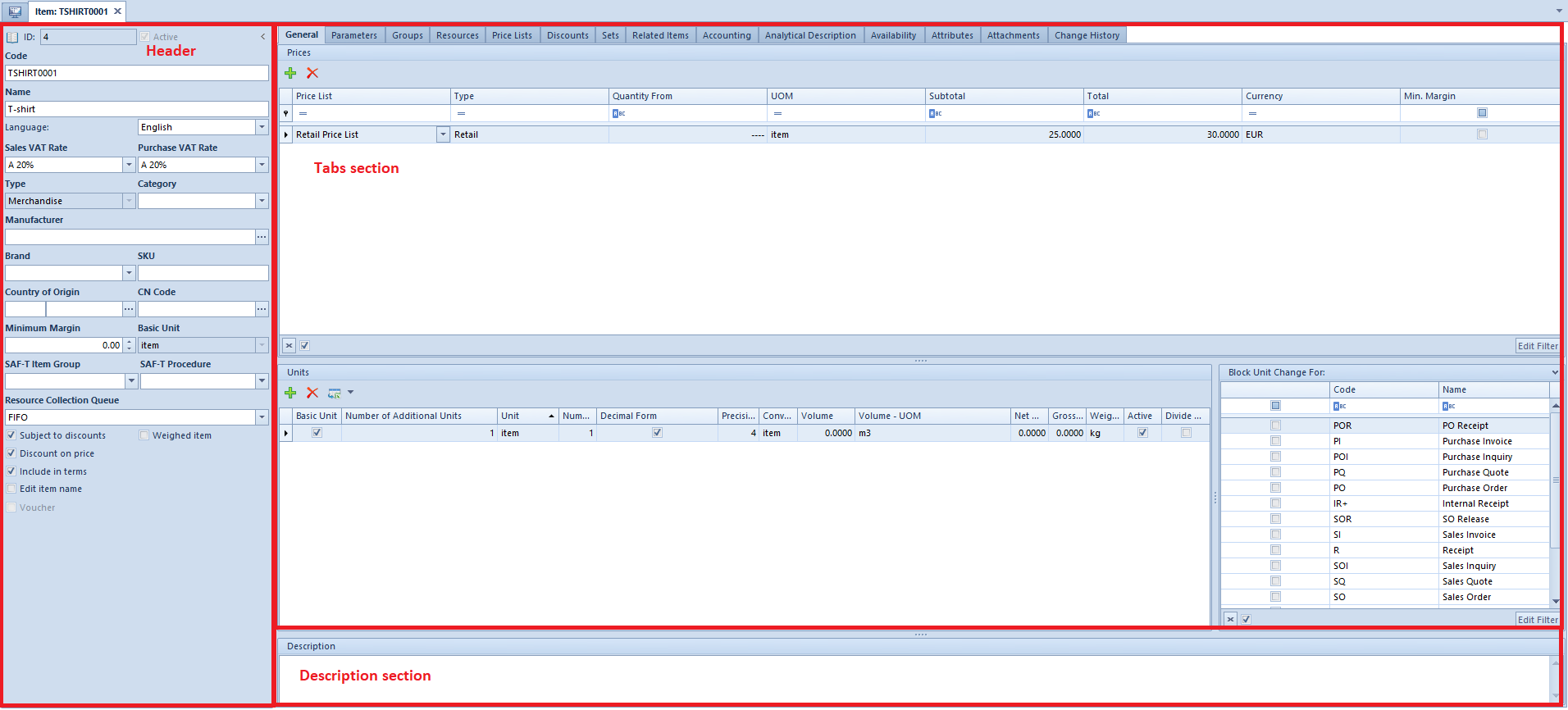
Forms
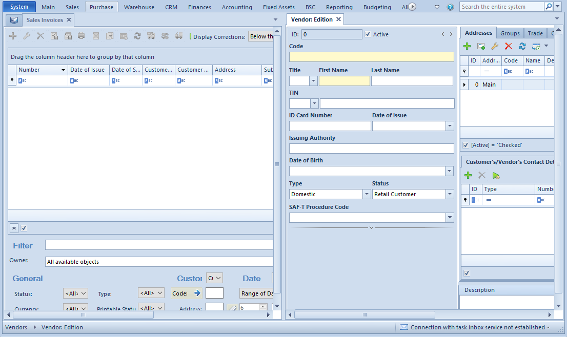
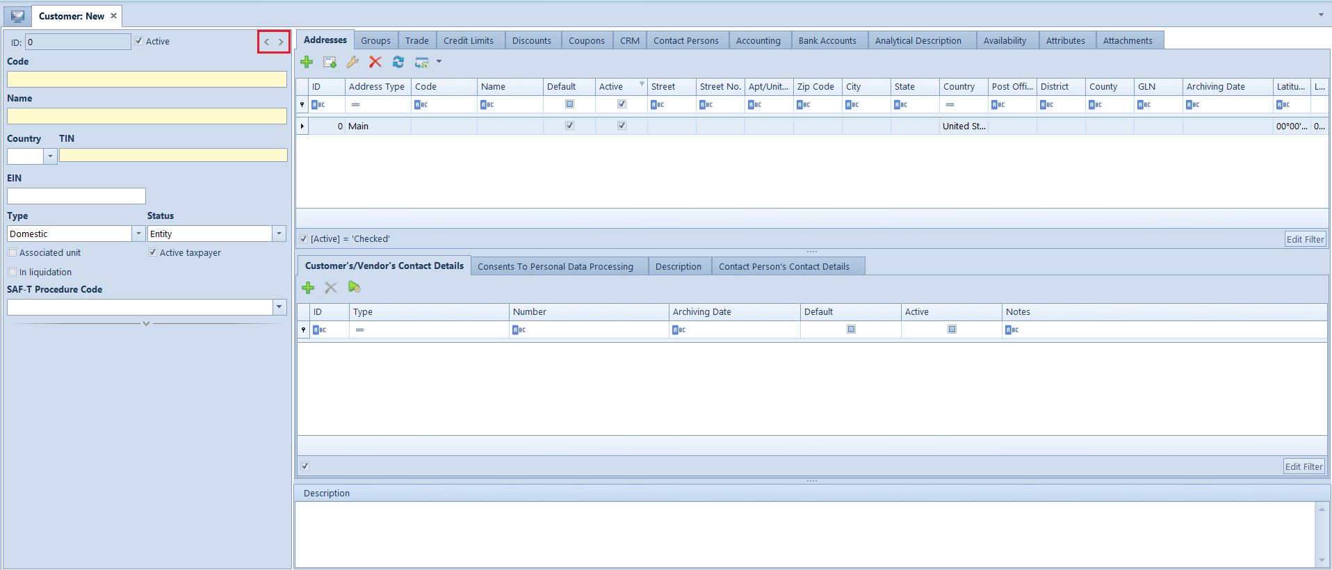
Forms represent the basic type of windows present in the system. Their layout and content vary depending on the type of a currently handled document or object. Most common forms available in the system are document form and object form.
Form layout
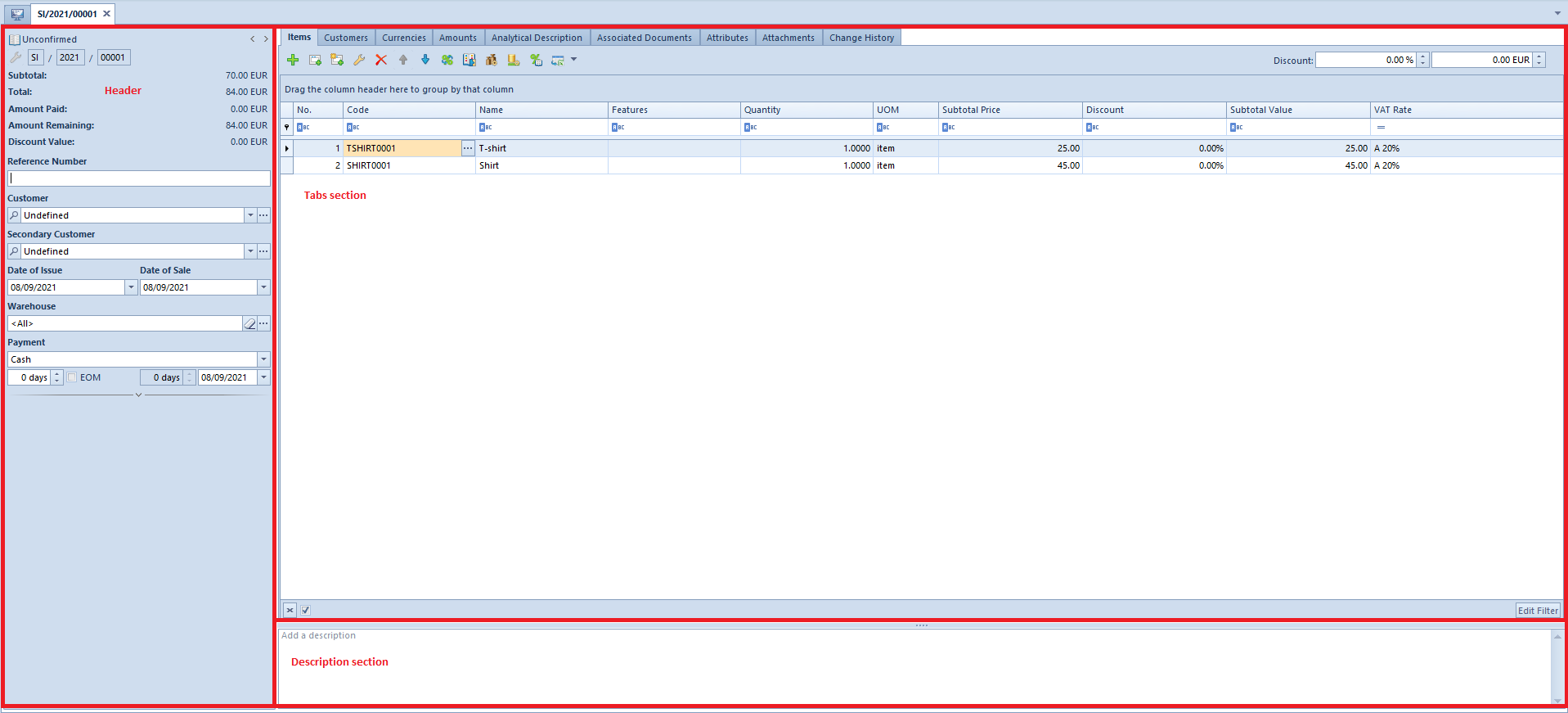
Most of forms are composed of similar parts:
Header (side panel) – is placed on the left side of a form. It contains the most important information for a given form.
Tabs section – is placed on the right side of a form. It presents detailed data regarding a given form.
Description section – is placed below the tab section. This section allows for entering additional information regarding a given form.
Document form – sales invoice
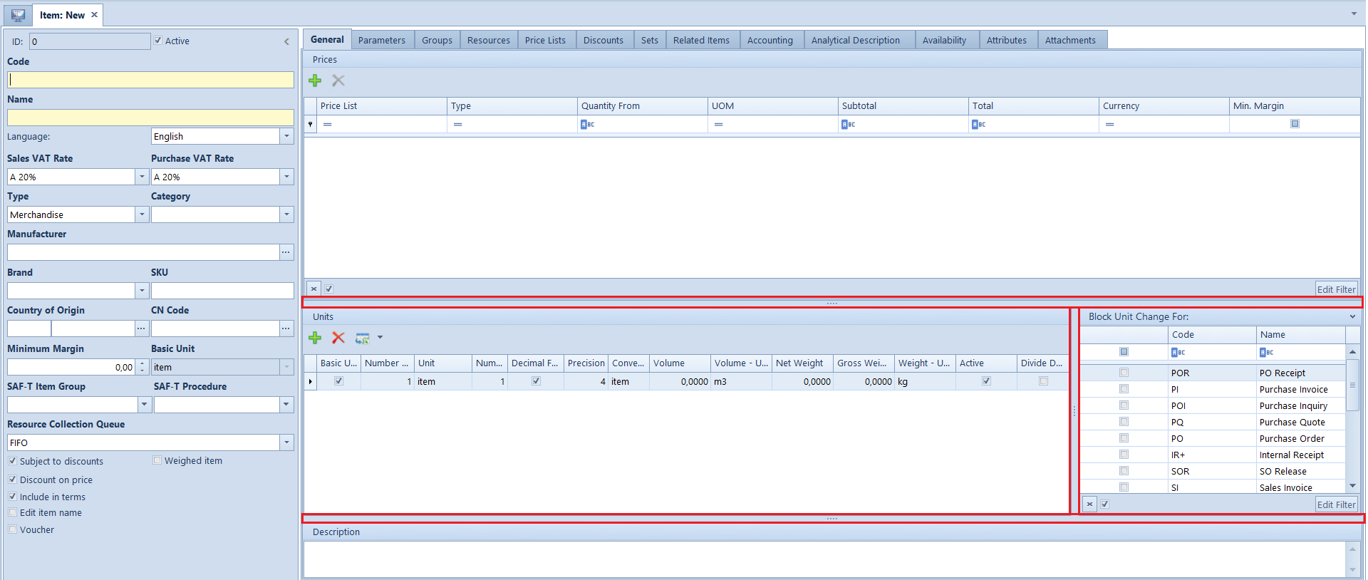
Object form – item
Standard fields and buttons on forms:
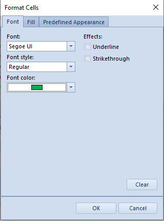
Mandatory field – marked in yellow. A mandatory field must be completed, otherwise the possibility of saving a form will be blocked.
Mandatory field
Eraser – deletes an object entered in a field from that field
Eraser button
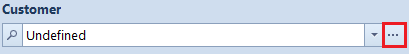
Magnifying glass – opens form of object entered in a given field
Magnifying glass button
Button for opening a list – opens a list of objects possible to select in a field
Button for opening a list
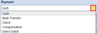
Button for expanding a list – allows for a quick selection of an object from a drop-down list
Button for expanding a list
Adjusting forms
A user can expand or hide a form header by clicking on one of arrows placed in the upper right corner of a header.
Buttons for expanding and hiding a form header
Button for expanding a hiding a form header It is also possible to adjust height or width of form sections separated by fields with a button with four dots. To do so, it is necessary to place the mouse cursor over separating field and drag it towards selected direction.
Fields separating sections.
For an advanced configuration of layout and windows content, including forms, it is possible to use Interface Editor.
Advanced column edition
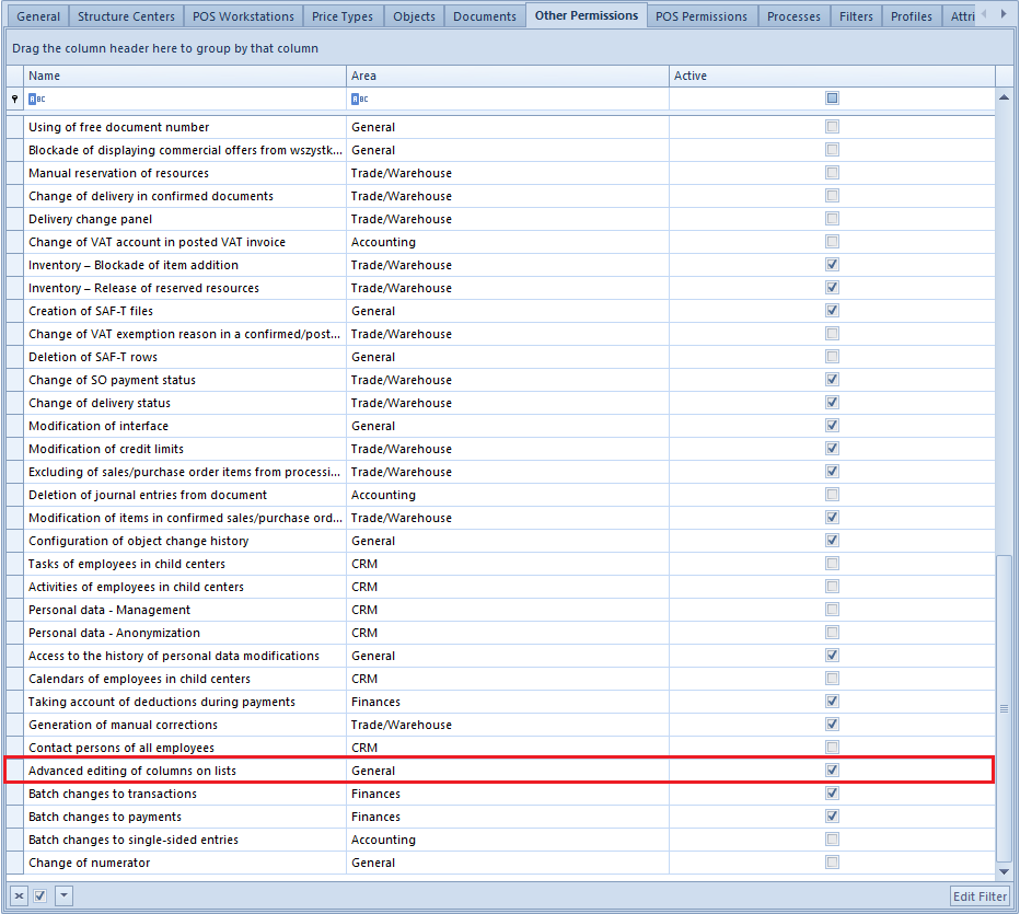
Besides the standard possibilities related to adjusting columns on lists, the system offers also a set of options allowing the user for an advanced column edition. The user can, for example, configure the visibility of columns for a specific operator group, add or delete additional columns or modify data related to columns, such us presentation of their names or tooltips.
Permissions for advanced editing of columns on lists
Advanced editing of columns is available for operators in possession of permission Advanced editing of columns on lists, which can be granted from the level of an operator group form, in Other Permissions tab. The permission is active, by default, for b2_admin operator group.
Advanced editing of columns on lists permission
Manage Columns window
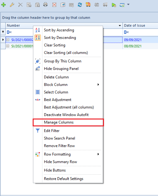
To open the window of advanced column edition, it is necessary to select Manage Columns option, which is available in the context menu displayed form column headers on lists.
Option Manage columns
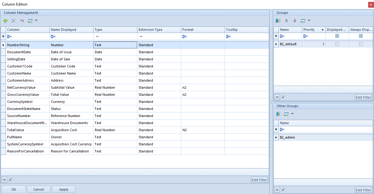
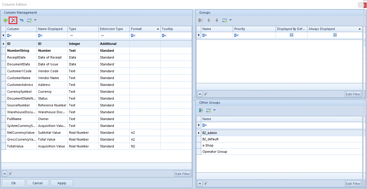
The window Manage Columns is composed of the following sections:
Column Management – displays standard columns, attribute columns and extension columns available on a given list, as well as additional columns upon adding them in Column Selection window.
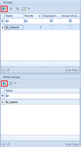
Groups – presents operator groups assigned to a column selected in the Column Management section. If an operator group is assigned to a given column, such column becomes visible for operators belonging to that group.
Other Groups – presents operator groups not assigned to a column selected in the Column Management section.
Column Edition window
Column visibility
Columns marked in the Column Management section are visible on a given list for those operators who belong to groups presented in the section Groups (this section narrows displayed results to those operator groups which are assigned to the currently marked column). To share a given column with an operator group, it is necessary to mark it in the section Column Management and next attach a selected group with the use of [Add Group] button, which is available on the quick access bar of the section Other Groups. Analogically, the user can detach a specific group from the Groups section with the use of [Detach Group] button.
Buttons [Attach group] and [Detach group]
Note
At the beginning, group b2_default is attached to all objects from the section Column Management. It means that all standard columns are visible, by default, for all operators (or can be displayed with the use of the option Column Selection – for hidden columns).
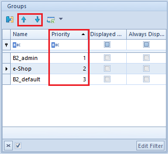
Changes of visibility of columns entered in the window Column Edition, are also saved in the database, for each operator individually. It means that if an operator belongs to many groups, the system will save the settings of the group with the highest priority assigned in the section Groups, in column Priority. In order to determine the visibility priority for a given group, it is necessary to use buttons [Increase Priority] or [Decrease Priority], available on the quick access bar of the section Groups.
Setting of the priority of columns visibility for operator groups
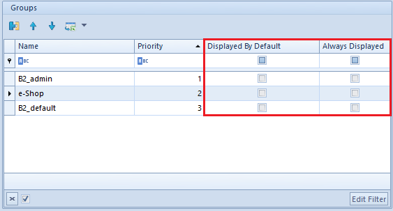
The section Groups contains also parameter columns:
Displayed By Default – if this parameter is marked, a given column will be automatically displayed on the list for a selected operator group. Otherwise, it will be possible to add such column to the list with the use of the option Column Selection.
Always Displayed – if this parameter is checked, option Delete Column is blocked for the operators who belong to a given group.
Visibility parameters in the section Groups
Hint
In the system, there is also available a mechanism allowing for parametrizing the access to columns with the use of the interface editor.
Adding columns
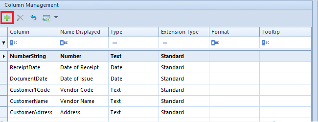
The user can add additional columns to the list, which are available in the data source (view, procedure, etc.). To do so, it is necessary to select [Add] button, which is placed on the quick access bar, in the section Column Management.
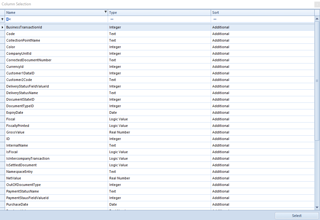
Button [Add] in Column Management sectionButton [Add] in the section Column management. An additional window Column Selection, where the user can select an additional column. The names of columns in the Column Selection window are displayed in accordance with the names in the database.
Column Selection window
To add a column, it is necessary to double-click a given row in the Column Selection window. It will appear in the section Column Management of the main Column Edition window.
Columns Modification
The section Column Management in the window Column Edition, contains the following columns:
Column – presents the name of a column, retrieved from the database
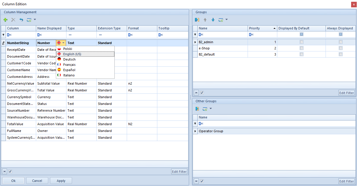
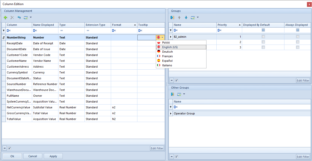
Name Displayed – allows for entering a name which will be displayed on the list for a given column. After selecting the flag button, it is also possible to add translations for the displayed name.
Selecting language of displayed name
Type – presents column type. Available values:
Text
Real Number
Integer
Logic Value
Natural Number
Date
Extension Type – presents column type. Available values:
Standard
Attribute
Additional
From Extension
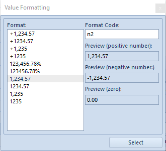
Format – allows for defining format of data displayed for columns of Natural Number, Integer, Real Number and Date type. Button , available in the column Format for these types, opens Value Formatting window, where the user can define data format in two ways:
By selecting a predefined format in Format field
By defining his/her own format in Format Code field
Value Formatting window
Tooltip – allows for entering a description which will be displayed in the tooltip of a given column on a list. After selecting the flag button, it is also possible to add translations for the description.
Selection of tooltip language
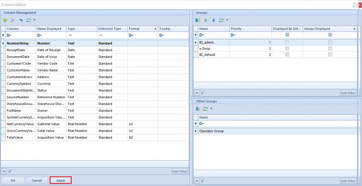
Before leaving the Column Edition window, it is necessary to confirm all modifications by clicking [Apply] button, available in the bottom of the window.
Button [Apply]
Deleting columns
The user can delete an additional column from the section Column Management, with the use of [Delete] button, which is available on the quick access bar. Deleting an additional column from the Column Management section deletes it also from a given list and block the possibility of displaying it (however, does not delete it from the database).
Button [Delete] in the section Column Management
Note
Standard columns, attribute columns and columns from extensions cannot be deleted from the Column Management section.
Hint
To make it impossible to display additional columns on the list and, at the same time, maintain modified settings for them, it is necessary to just detach operator groups from that column, without deleting them from the section Column Management.
Column adjustment
Deleting and adding columns
The system allows for deleting (hiding) and adding (displaying) columns available on a given list. Thanks to that, is is possible to adjust the appearance of a given list to user’s needs.
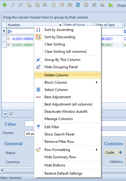
To delete a column, it is necessary to click right mouse on button its header and select [Delete Column] button from the context menu.
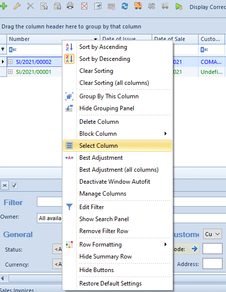
[Delete Column] button[Delete Column] button. To add a column, it is necessary to click right mouse button on the header of any column displayed on a list and select [Column Selection] button from the context menu.
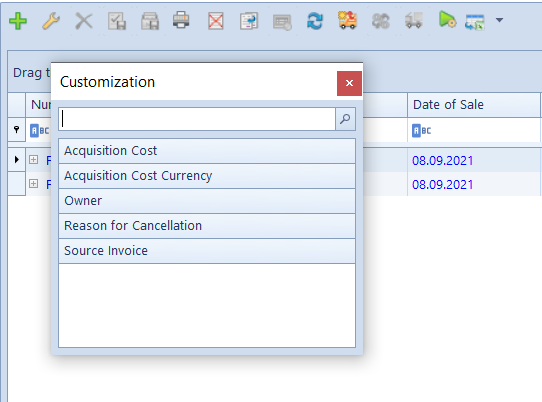
[Column Selection] buttonThe button opens Customization window, which contains the names of hidden columns available on a given list. If there are hidden columns created on the basis of attributes assigned to an object, the names of such columns are marked in italics. The user can add a hidden column in two ways:
By double-clicking on its name in the Customization window
By dragging the name of that column and placing in in a specific place on the column headers bar, which allows to precise the position of the column
Customization window
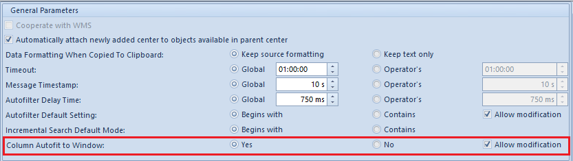
Changing column width
In the menu System → Configuration, in Computer tab, there is parameter Column Autofit to Window which allows for automatic fitting of the width of columns on all lists of the system. After checking option Yes, which is available for the parameter, columns are located proportionally over the entire width of a list window.
Parameter Column Autofit to Window the menu System → Configuration
Option Allow modification allows for activating or deactivating the automatic width of columns, regardless of the settings of the main parameter. Once the option is selected, an additional option Activate/Deactivate Window Autofit appears in the context menu.
The user can also freely change the default width of columns displayed on lists. To do so, it is necessary to indicate with the mouse cursor a line limiting the width of a given column and drag it to the left or to the right, until the expected result is achieved.
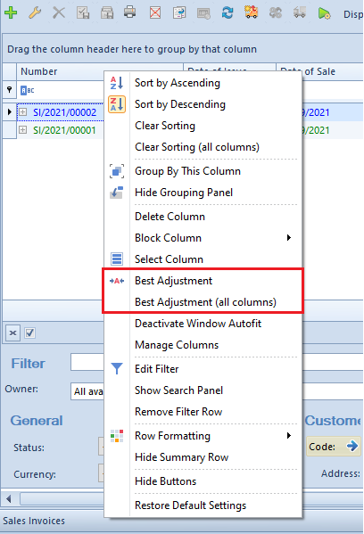
To set optimal size of a column or of all columns on a list, it is also possible to use Best Adjustment or Best Adjustment (all columns) option, which is available in the context menu opened by clicking right mouse button on the header of a given column.
Best Adjustment
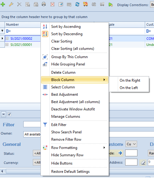
Blocking columns
The context menu on lists contains Block Column option. It allows the user to place selected column permanently on the right or on the left side of a list. Until such column is unlocked, which can also be done from the level of the context menu, its position is blocked and cannot be changed. The user can block any number of columns on selected side of a list.
Block Column option
Conditional formatting
The functionality of conditional formatting allows for distinguishing particular values in columns with the use of colors, change of formatting and adding appropriate icons classifying values of columns to specific intervals. Thanks to the conditional formatting, the user can decide, according to his/her own needs, how data is displayed on lists in the system and improve its readability.
Row conditional formatting options
The user can determine conditional formatting for any column. To do so, it is necessary to click the right mouse button in a column header, indicate Row Format option with the cursor and select one of the following options:
Data bars (allowing for marking values with different width and colors of bars)
Color scales (coloring rows with different colors)
Icon sets
Option Manage Rules opens a new window which displays all rules defined on the list. The window allows for adding new rules and editing or deleting of already existing rules. Here it is also possible to determine the order of executing rules on a given list.
Rules managing window
A new formatting rule can be added with the use of [New Rule] button.
New formatting rule window
A new formatting rule window contains the following options:
Available rule type options:
Format all cells based on their values – all cells from a formatted column will be equated to scale specified in the rule. Only for this formatting type it is possible to determine comparative scale. This formatting does not allow for applying rule to entire row
Format only cells that contain – only cells satisfying the rule condition are formatted. This formatting allows for applying formatting style to entire row
Format only top or bottom ranked values – this option formats first or last values of cells from a given column. This option allows specifying how many cells should be formatted. It is possible to apply formatting to entire row
Format only values that are above or below average – average from values of cells of a given column is calculated and values above and below that average are formatted, respectively. This option allows for formatting entire row
Format only unique or duplicate values – this option formats only those cells which have unique or duplicate values within entire column
Use a formula to determine which cells to format – this option allows for creating own complex algorithm for formatting cells. It is possible to apply formatting to entire rows
Available rule description options:
On the basis of scale – option available only for type Format all cells based on their values. It allows for selecting 2-color scale, 3-color scale, data bar or icon set for graphic presentation of data. The most important possibility is specifying a scale in percentage or numeric formats in any ranges. The formatting applies only to cells from a given column – it cannot be applied to entire rows
On the basis of cell values – option available for all the other formattings. It is used to specify font, its color, font style settings (bold, italics, underline, etc.) and cell background. Predefined formats are also available. It is possible to apply formatting to entire rows
In the upper right corner of the rule manager window, there is a selection field enabling filtering of rules for each column from the list separately.
Example
In order to increase clarity of the item list, the following list formatting rules will be added:
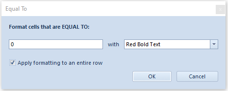
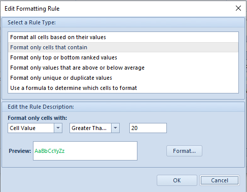
For quantity equal to 0, row text will be displayed in bold and in red – must be applied to entire row
In Quantity column header, open context menu with the use of right mouse button and select option Row Formatting. From the displayed menu, choose Highlight Cell Rules and then Equal To….
In the first field of the opened window, specify value to which all values from rows of column Quantity will be compared.
For the formatting to be applied to entire row, option Apply formatting to an entire row must be selected.
Formatting style can be selected form the list of predefined styles. Select style Red Bold Text. Click [OK] for the changes to be applied.
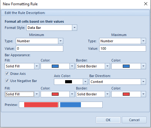
For quantity greater or equal to 20, row will be displayed in green – must be applied to entire row
In Quantity column header, open context menu with the use of right mouse button and select option Row Formatting. From the displayed menu, choose Manage Rules.
In order to add a new rule, select [New Rule] and then the option Format only cells that contain. In the bottom part of the window in drop-down lists, set Cell Value and Greater Than or Equal To. In the displayed field, enter value to which values from rows will be compared – in this particular case, 20.
Next, open the window for selecting cell formatting by clicking on the button [Format]. According to the mentioned requirement, set font color to green.
Confirm addition of the new rule by selecting [OK].
In the window for managing rules, it is also necessary to select option Apply to the row so the formatting pertains to entire row.
For available quantity, add data bar presenting in graphic form available resource on a scale from 0 to 100
Upon opening context menu of Quantity column and selecting Row Formatting, choose option Data Bars. Select one of the available bars. In the new window, specify the scale. Set type Number for Minimum and Maximum and scale from 0 (Minimum) to 100 (Maximum). Set any colors for the data bar.
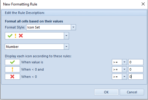
Items with 0.00 subtotal price should be marked with red X sign
Open context menu for column Subtotal and select Row Formatting. For option Icon Sets choose from group Symbols and set type Number.
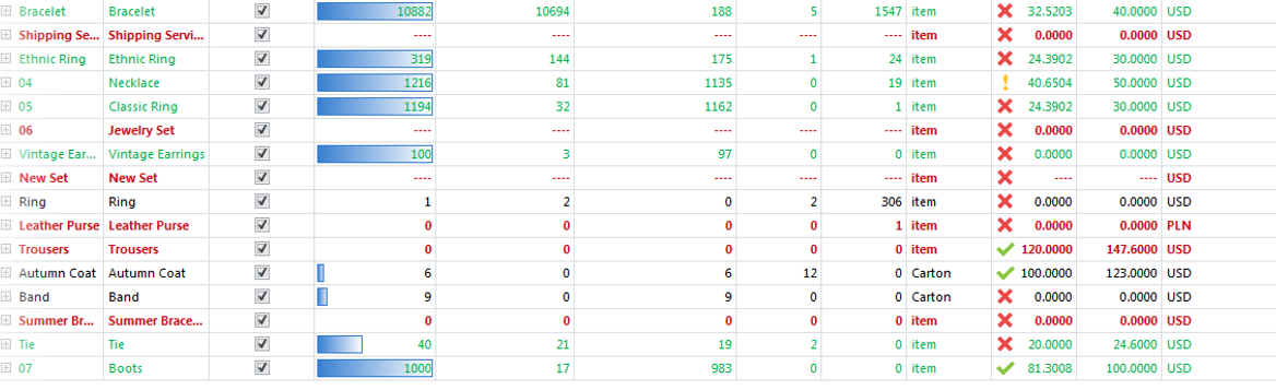
After all the defined rules are applied, the list of items should look as follows:
Exporting data to spreadsheet
The system allows the user for exporting data presented on lists and forms to a spreadsheet.
Data export configuration
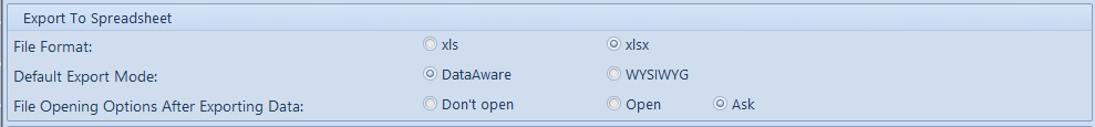
Default settings of the functionality of exporting data can be changed in the menu System → Configuration → Computer, in section Export To Spreadsheet.
Export To Spreadsheet section in Computer tab
The section Export To Spreadsheet contains the following options:
File Format – allows for specifying format of spreadsheet created during data export:
xls (default) – handles 256 columns and 65536 rows
xlsx – handles 16384 columns and 1048576 rows. This format is handled from the version of Microsoft Excel.
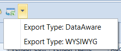
Default Export Mode – allows for selecting a default mode of exporting data to a spreadsheet:
DataAware (default) – allows for exporting data along with conditional formatting rules applied for a given list
WYSIWYG – presents exported data in the same or similar layout to that displayed in the system. This mode handles Ageing Structure of Clearings printout, in which there is an option implemented for sending to spreadsheet the section with details for master-detail structure. This option is not supported in DataAware mode.
File Opening Options After Exporting Data – allows for determining if a file should open after data is exported:
Don’t open – a file will be saved in a selected location with no data preview
Open – data will be displayed only in the preview window without saving a file on the disk
Ask (default option) – a file will be saved in a selected location, and the system will ask the user if he/she wants to open it. Upon confirmation, the file will be opened directly in a spreadsheet.
Data export
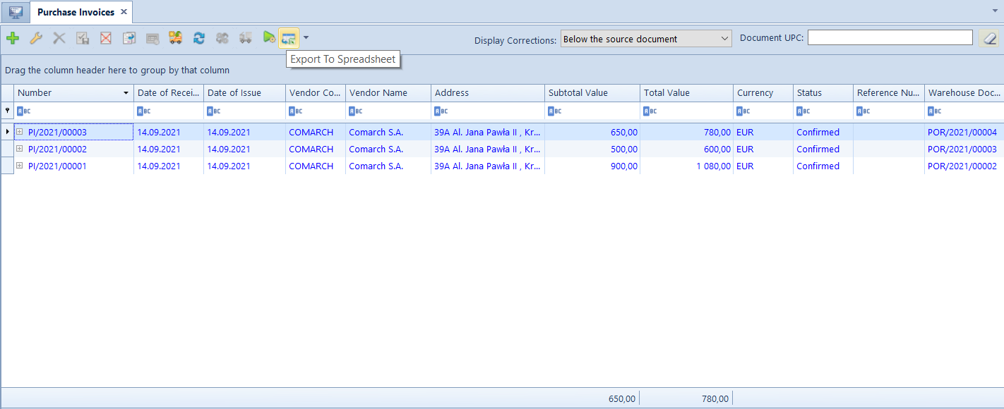
To export data from a list or form, it is necessary to click on [Export To Spreadsheet] button, available on the quick access bar.
Button [Export To Spreadsheet] on the list of purchase invoicesBefore exporting data, regardless of default settings, the user can also select the direct mode on a given list or form, by indicating the appropiate option in the drop-down menu available next tot the [Export To Spreadsheet] button.
 , available in the column Format for these types, opens Value Formatting window, where the user can define data format in two ways:


 from group Symbols and set type Number.