
General information
To add a new profile, it is necessary to select button [Add] from the Profile Editor ribbon. A window opens, where the user can define the name of the new profile.
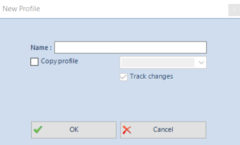
A profile can also be defined on the basis of already existing profile. To do this, you need to check the parameter Copy profile and then select a profile from the list of the available profiles. If checked, an appropriate entry, that combines the newly created profile with the profile on the basis of which the former profile was copied, will be created in the database. It won’t be possible to include the changes made in one profile can be included in associated profiles by checking the option Track changes after conversion.
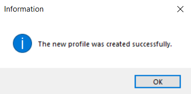
The entered changes can be confirmed by clicking [OK]. The message confirming the creation of the new profile will then be displayed.
MainTabs tab
To add tabs to the main tab, mark a tab on the tree in the Explorer panel and then click [Add Tab]. A window presented below will then be opened:
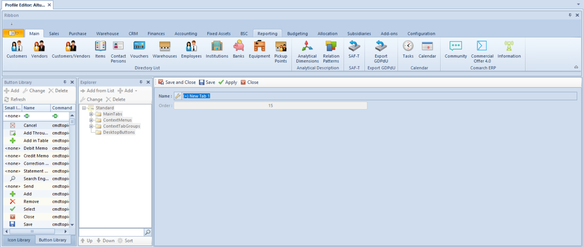
To add a tab, first the tab name must be given in the system language. The name can be typed upon clicking on the arrow symbol. In an opened window, apart from specifying the name, it is possible to define its translations in other languages and to define shortcuts. Translation can be provided upon prior selection of a language. After defining the tab name in the system language and possibly in other languages, the specified name must be confirmed by clicking [Confirm]. Setting on order is not required, but the editor allows the user to set the order of tabs in the menu individually.
A shortcut is created automatically for each tab and button (standard and added by operator). The system will select the first letter of the tab name. If there is already another tab or button with name starting with the same letter, the system will select the second letter or, if necessary, the following ones, until the shortcut of the tab or button is unique.
A button group is added to a tab by clicking [Add Button Group]. A button group form is then opened:
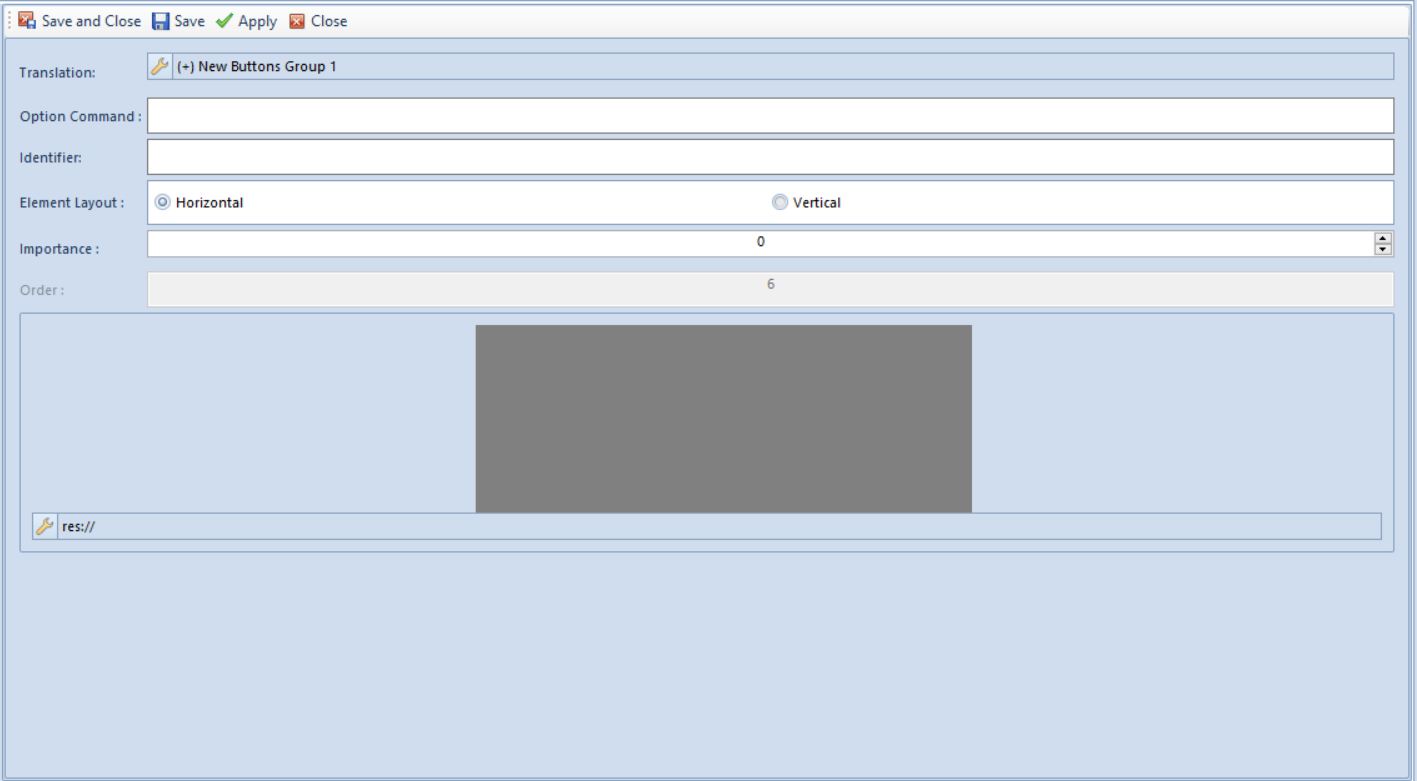
The name of the button group is defined in the group form the same way as in case of tab name.
- Translation – group name in a given language
- Option Command – if checked, it is possible to enter a command into the field
- Identifier – provides information identifying a given group
- Elements Layout – possible options are horizontal or vertical position of the button group
- Importance – the bigger natural number the later it is collapsed when decreasing the application window
- Order – field for specifying the order of buttons on the list
- Big Icon – an icon can be selected from the list or entered manually
Adding an element (buttons) to a group consists in the selection of an appropriate button group in the Explorer panel to which the button selected in the Buttons Library panel must be added. The selected button must be confirmed by clicking [Append Button] available in the Elements button group. In an opened form, the user may define a target layout of the button in the main menu.
The form is composed of the following fields:
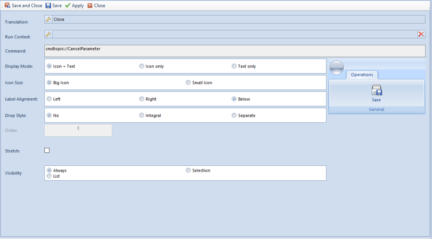
- Translation – button name which will be displayed in a given language in the main menu. A name is defined in the entire profile editor in the same way (see chapter Main tabs)
- Run Context – clicking on the button located in this field enables the selection of a context from the list to be run
- Command – command running the button
- Display Mode – method of presenting a button Icon + Text, Icon only, Text only
- Icon Size – the size of the button’s icon; possible options are: Big, Small
- Label Alignment – position of text against icon, possible options are: Left, Right, Below
- Drop Style – collapsing method, possible options: None, Integral, Separate
- Order – order of the button within a button group
- Stretch – if checked, a button name will be stretched
- Visibility – determines whether a button will be visible in a mode of List, Selection or Always
- Quick Access Panel – is available only in the ContextMenus group and if checked, the button icon will appear in the quick access panel; the user may also define an order of the icon on the panel
ContextMenus context menu
A context menu is used in the system in all lists of documents/elements. By clicking the right mouse button on the list of elements, it will be presented in the form of a drop-down menu or a quick access bar which is available below the list. A new context menu is added by clicking [Add Menu] upon prior selection of the ContextMenus on the tree. A context menu form, where the buttons are grouped, is opened.
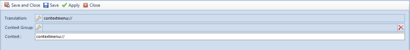
The form contains the following elements:
- Translation – name of the menu in a given language
- Context Group – enables the selection of context from the list
- Context – command referring to an appropriate context in the system
Buttons are added to a context menu in the same way as in the case of the MainTabs tab.
ContextTabGroups context tabs
A new group of tabs is added by clicking [Add Context Tab Group] upon prior selection of the ContextTabGroups on the tree. A form presented below is then opened:
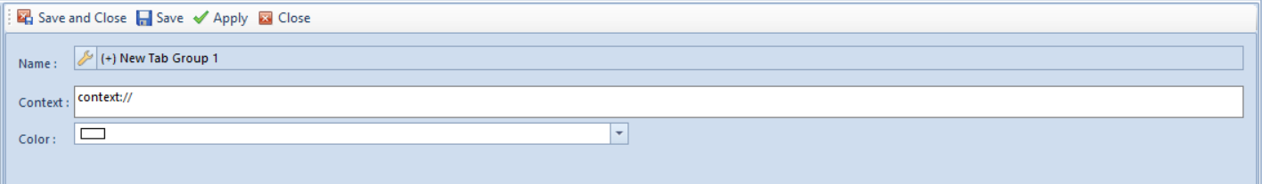
The form contains the following items:
- Name – tab group name
- Context – context name
- Color – setting a color for a tab group
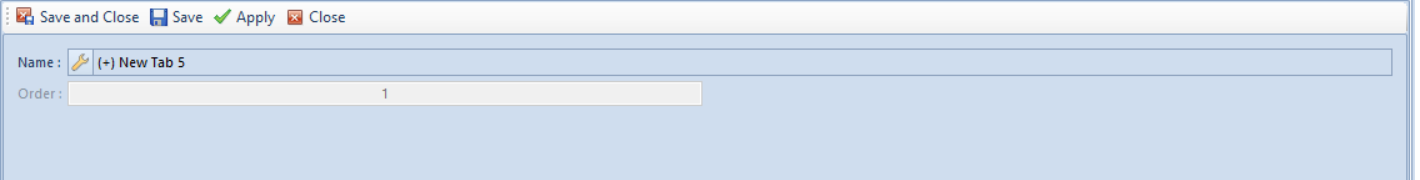
To add a new tab, upon marking a tab group on the structure tree, it is necessary to select [Add Tab] option. The following form is opened:
To add a new button group, upon marking a tab on the structure tree, it is necessary to select [Add Button Group] option. The following form is opened:
Group of buttons and buttons are added to the context menu in the same way as in the case of the MainTabs tab.
DesktopButtons desktop shortcuts
In Comarch ERP Standard, it is possible to add icons – shortcuts to a given place in the system. However, this option is available only for buttons in the Main Tabs.
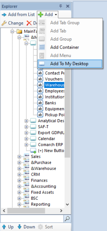
In order to add a button icon to Comarch ERP Standard desktop, the option Add To My Desktop can be used, which is called from the drop-down menu upon clicking on the button [Add] in the Explorer panel menu. This option is active if in the Explorer panel an element located on the lowest level of the tree, i.e., a button, in the Main Tabs is selected. Upon selecting the option Add To My Desktop and saving changes, entry for a given button is copied to the DesktopButtons.
The button will appear on the desktop upon restarting the system.
Upon adding an icon, it is possible to:
- freely arrange icons on your desktop of Comarch ERP Standard system, on the same basis as it is done in Microsoft operating systems
- double-click on icon to activate the functionality associated with a given icon
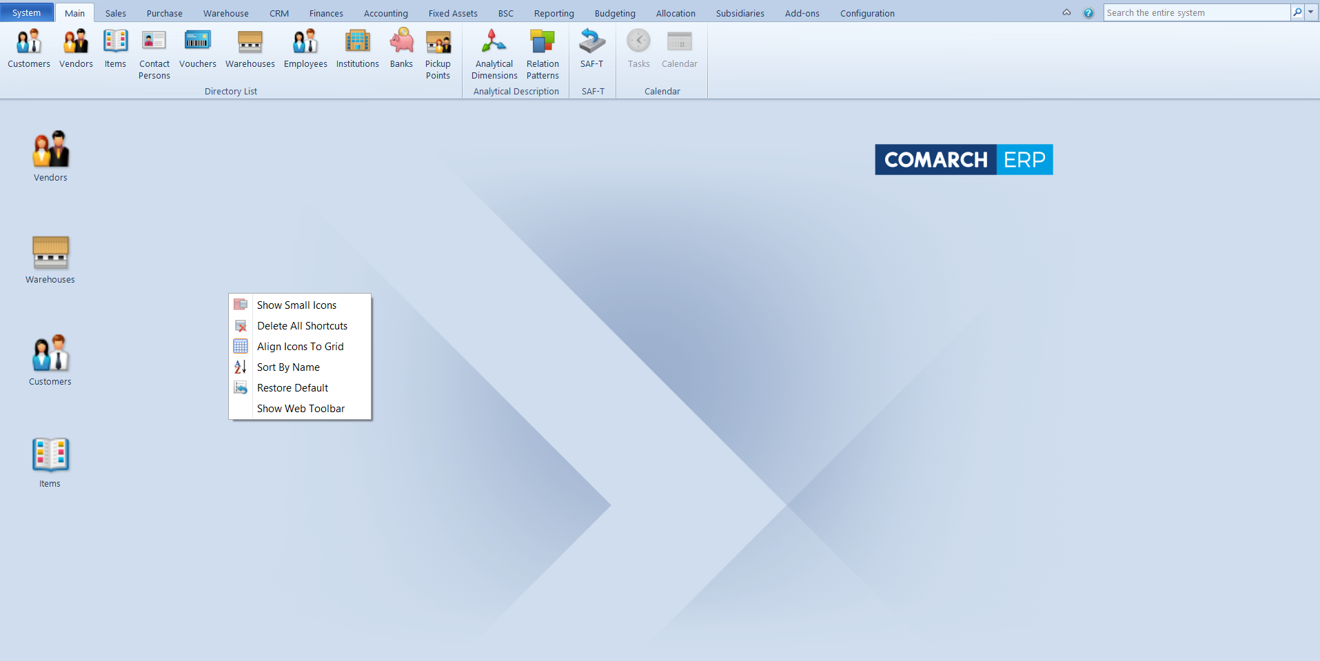
- activate context menu upon clicking the right mouse button on the icon or on desktop. Options available in context menu are the following:
-
- [Show Small Icons] – changes size of icons displayed on the desktop
- [Delete All Shortcuts] – removes all icons from the desktop
- [Align Icons to Grid] – icons will be aligned according to grid
- [Sort By Name] – icons will be sorted by name and arranged one under another, starting from the left upper corner
- [Restore Default] – – if selected, the default icons layout on desktop is restored
- [Show Web Toolbar] – shows a toolbar with references to community portals
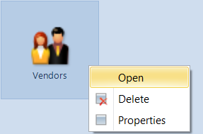
- Activate context menu for a given button by clicking on it with the right mouse button. The context menu contains the following options:
- [Open] – opens a reference
- [Delete] – removes a shortcut
- [Properties] – opens the button properties window. In this window t is possible to enter translation of the button name in different languages and change the icon.