
The purpose of the profile editor is to enable the user to interfere in the layout of the main menu (ribbon), context menu, quick access bar, or the ergonomic panel. An easy modification or addition of a profile is possible thanks to the created frame structure of the profile which composition is described in this article
Profile structure
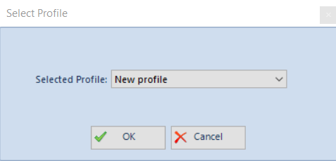
The profile editor is composed, by default, of the Standard profile which can be edited in accordance with the user preferences. By clicking [Load] and selecting the Standard profile, the profile is automatically loaded.
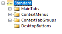
Each profile is composed of four standard elements: tabs MainTabs,, context menu ContextMenus, context tab groups ContextTabGroups, and desktop shortcuts Desktop Buttons. All these elements can be found in the Explorer panel.
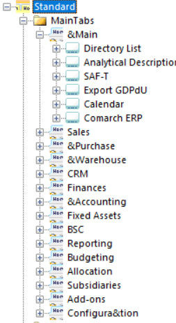
The MainTabs branch contains the basic tabs, which are displayed in the main menu right after the system is started. From the level of these tabs, it is possible to open subsequent tab groups which are assigned to contexts.
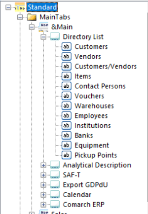
Button groups can be added to tabs and particular elements can be added to the groups. For example, a group Directory List (name of the whole group) and the elements: Employees, Banks, Warehouses etc. were added to the tab Main.
Another element of the profile is the context menu ContextMenus:
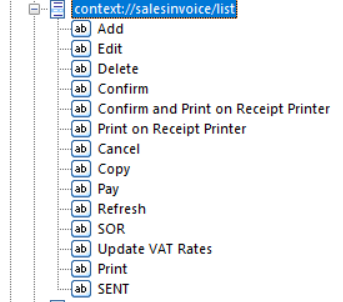
Buttons are added directly to context menus. After adding a button, there is no need to format it (its size, text location, etc.) Each button is formatted automatically.
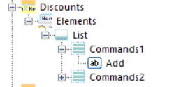
The last component of the profile is context tab groups ContextTabGroups.
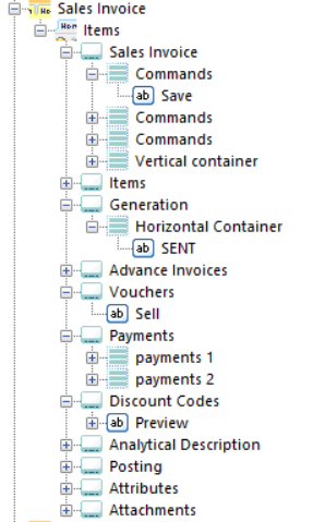
To the context tab groups, it is possible to add groups/context tab groups (e.g., Chart, Table, Discounts), and to the group/context tab group, it is possible to add a tab Items. Then, to this tab, it is possible to attach button groups (e.g.: Payments) and to the group, it is possible to add buttons (e.g. [Close], [Apply]).
Button
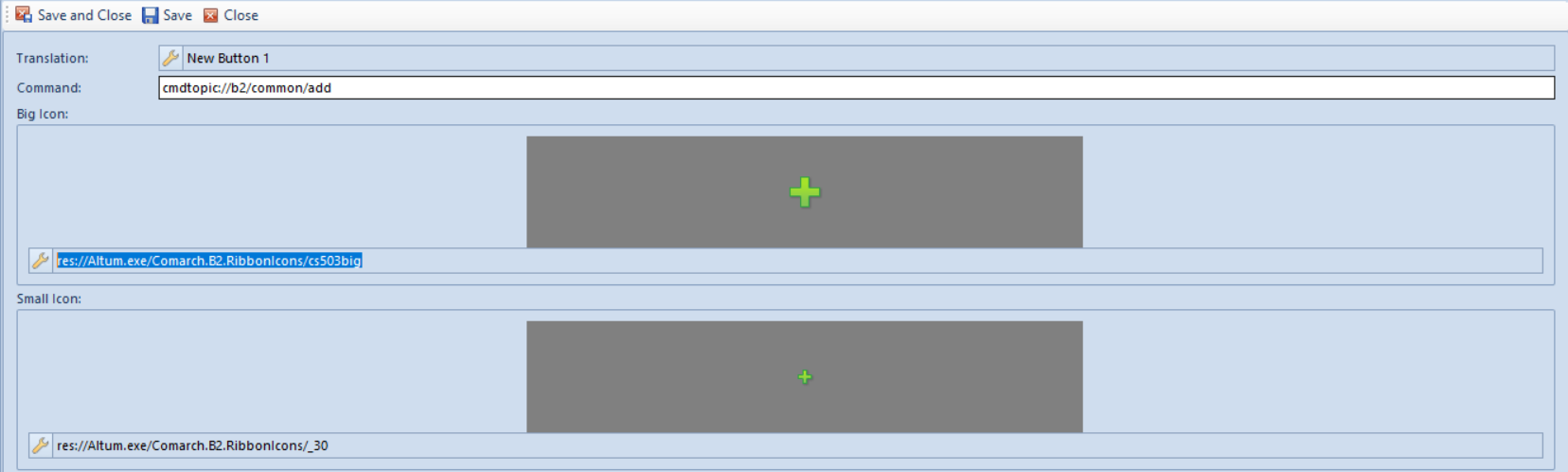
In the profile editor, there is a separate section in the menu which allows for the addition, modification or deletion of a button. A new button can be added by clicking [Add] in the Button Library panel. A button form will then be opened:
- Translation – button name and its translations in other languages
- Command – command defined for the button
- Shortcut to Command – allows to enter an abbreviation to the button by pressing the combination of the keys: Alt+key referring to the command
- Big Icon – allows the selection of a big icon for given button
- Small Icon – allows the selection of a small icon for given button
After defining the new button, it must be saved by clicking [Save] or [Save and Close] in the main menu.
A request to save the button will be registered in the Pending Changes panel. The button can be saved in the configuration database by clicking [Save] in the Pending Changes panel.